real biathlon
    • Athletes
    • Teams
    • Races
    • Seasons
    • Scores
    • Records
    • Blog(current)
    • More
      Patreon Content Course Profiles Explanations Shortcuts
      Error Report
      Privacy Policy About
    •     
  • Forum
  • Patreon
  • Twitter
  • YouTube
    Instagram
    Facebook

Recent Articles

  • Most improved athletes this winter
  • New biathlon point system
  • Historic biathlon results create expectations. But what about points?
  • What do you expect? Practical applications of the W.E.I.S.E.
  • Introducing W. E. I. S. E: the Win Expectancy Index based on Statistical Exploration, version 1

Categories

  • Biathlon Media
  • Biathlon News
  • Long-term trends
  • Statistical analysis
  • Website updates

Archives

  • 2022
    • December
    • June
    • May
    • March
    • February
    • January
  • 2021
    • December
    • November
    • September
    • July
    • June
    • May
    • April
    • March
    • February
    • January
  • 2020
    • December
    • November
    • August
    • June
    • March
  • 2015
    • December
  • 2013
    • August
    • July
  • 2012
    • July

Search Articles

Recent Tweets

Tweets by realbiathlon

Author: biathlonanalytics

Proud dad&husband; analyst & visualization specialist (Tableau, SQL & R); creator of Biathlon Analytics; blog poster on realbiathlon.com; passionate about biathlon, cross country skiing and canoeing

A continued exploration of shot data

Posted on 2022-01-14 | by biathlonanalytics | Leave a Comment on A continued exploration of shot data

Introduction

I had a fun discussion with Bjorn Ferry, Biathlon23 and SportInDepth on Twitter. We debated if taking the 4th and 5th shot after shooting clean on the first three, is (mentally) harder than when you already have a miss in your first three shots.

After presumably reading my article Is one shot like any other in biathlon Bjorn sent the following chart and messages:
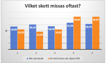
My thesis is that the last shot is difficult only if you did not miss earlier in the competition. If you only look at those who hit the first 9 shots on a sprint, I think the last shot has bad statistics. But not for those who missed already in prone.

I went through the individual and the sprint competitions in Pokljuka back in 2018 to find out if it is the case that the last shot is more difficult. I compared all shooting series (6410 shots) with those that arrived to the last standing with the chance to shoot clean.->

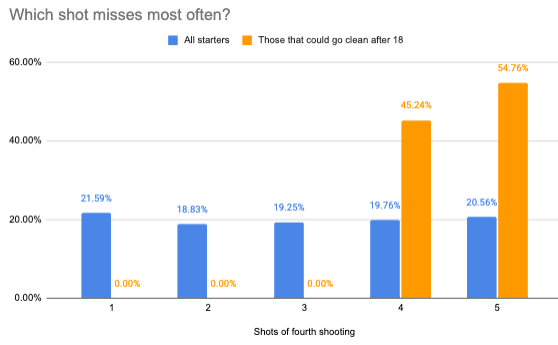
Shot 1,2,3,4,5; which is most often missed? For the entire starting field it was no clear tendency to miss shots four or five more often. For the group that arrives to the last stand with the chance to shoot clean, it becomes clear that shots four and five are harder. ->

It is also logical because then you have the chance to make a really good result. The pressure is increasing. *whole field = blue bars those with the chance to shoot full = orange bars

It would be fun to see if this is true if you look at an entire season. If you hit the first 8 targets in a sprint, or the first 18 targets in the other disciplines. What does it look like then? I think the fourth and fifth shots are harder.

Caveat

Before I continue, I want to be very clear. One, I am not a statistician, and two, Bjorn probably knows a little more about biathlon than I do, based on his 7 wins and 22 top-3’s in the IBU World Cup, World Champs and Olympics, not even counting his 7 medals in relays. So to go out and say I did not agree with his findings was, well scary.

Data

My data however told me a slightly different story. We also started with different datasets. His data was from the individual and sprint competitions (not sure if it includes men and women) in Pokljuka in 2018 only looking at the final standing shooting, for 6410 shots. Mine was from the 2017-18 season onwards to the Oberhof event in 2021-22. It includes the final standing shooting of the Sprint, Pursuit, Mass Start and Individual events. I also only included the top 30 athletes. And 6,410 shots -vs- 31,419 will make a difference. Not better or worse, but less influenced by outliers, and more predictable.

I did not have the data in a format where I could replicate the chart from Bjorn, so initially I took a different approach in my analysis.

Analysis, approach one

The chart shows the number of hits and misses per shot of the last shooting of an event (so 2nd shooting for Sprint, and 4th shooting for the other events). As shown in the previous article, the first and last shots have the lowest hit rates.

This data can be copied from Tableau to Google sheets where I can create a table that shows the probability for every shot combination.
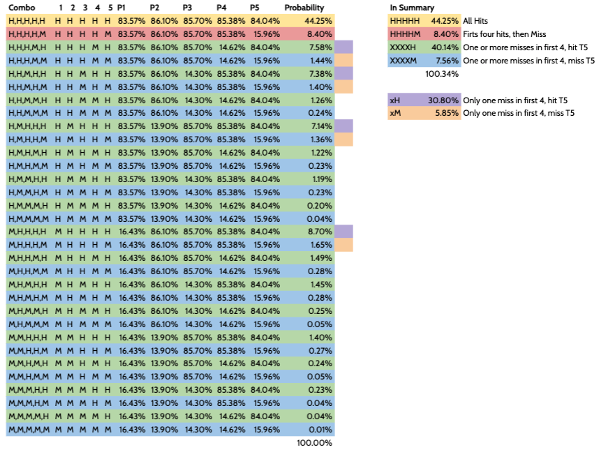
Now that we have a list of probabilities for every shot combination, we can group these combinations into:

CombiProbability
  • All hits
  • 44.3%
  • First 4 hits, miss T5
  • 8.4%
  • One or more misses in first 4, hit T5
  • 40.1%
  • One or more misses in first 4, miss T5
  • 7.6%

    So hitting the fifth target after hitting the first four targets has a higher probability than when missing one or more targets in the first four shots. This conclusion is different from the conclusion Bjorn drew from his chart, but perhaps this is simply because I didn’t replicate the chart he used.

    Analysis, approach two

    To compare apples to apples I want to duplicate the chart from Bjorn. First, I used a different subset. Still from the same seasons, I included all athletes rather than the top 30 only. I also limited the data to only Mass Starts and Pursuits to limit the number of records (Goole Sheets crashed with more than one million cells). Also, these race disciplines probably have even more pressure, since it (wo)man to (wo)man rather than time-based. This left me with 107 races and 358 athletes for 98,400 shots.

    I moved this data over to Google Sheets where I could use the Pivot functionality to create the following table with Athlete, Race and shot full (20 shot) combination, in which the M indicates a miss and H a hit:

    Going back to Tableau, I could now calculate the misses for every shot of the fourth (and last) shooting session, and create two groups of athletes: one that started the fourth shooting with 15 hits, and one that had at least one miss in the first 15 shots.
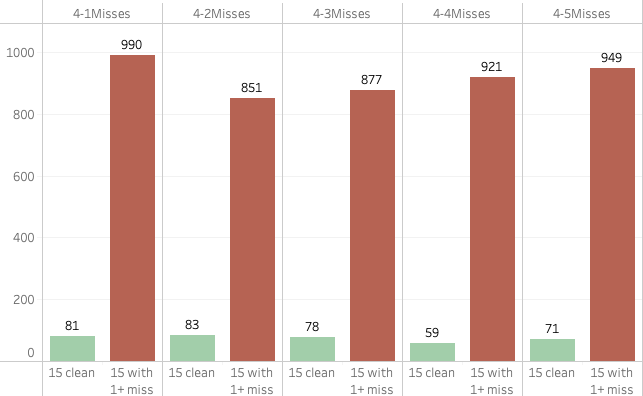
    Going back and forth

    Unfortunately, the way the data is formatted I could not convert this data to a percentage, so back to Google sheets I went to create a conversion table, which I then could use to create the chart similar to Bjorn’s.

    When I display the percentages for the group of all athletes as well as those that came into the fourth shooting with zero misses, again the conclusion that can be drawn is different from Bjorn.
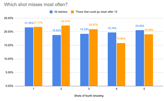
    Let’s quickly put them side by side again to compare:

    It is clear why Bjorn felt his data and chart are supporting his thesis that shooting targets 19 and 20 is harder when you go clean in the first 15 shots, compared to when you have a miss already. And I do agree with him that if you think about it would make sense. But no matter how I look at my data, I cannot come to the same result. The fourth shot is actually missed the least and the fifth is missed less often than shots one, two or three. Of course, for the fifth shot, this includes both those who shot clean the first 15 and then missed one or more shots in the final shooting.

    First 18 shots clean

    So what if we look at those shootings where the first 18 were clean? I basically did the same exercise adding up the misses per group in Tableau. Obviously the first three shots have no misses since the first 18 are clean. That doesn’t leave us with much data, with only 84 misses in total on the fourth and fifth shots.
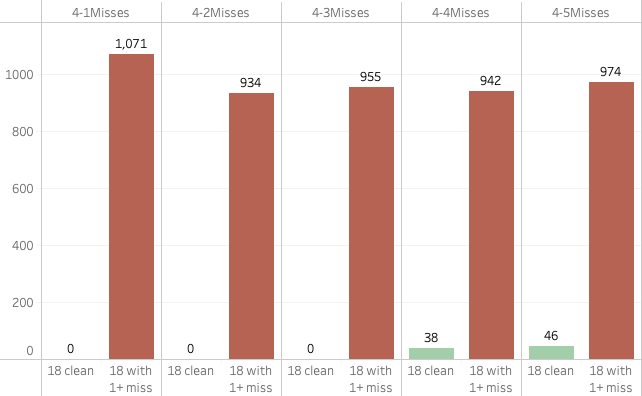
    Again we bring this over to Google sheets and calculate the percentages.

    From there we create a chart, from which I conclude that if anything the fifth shot is harder than the fourth, confirming our earlier finds that the first and last shots of a shooting are the hardest. But to draw any conclusions based on 84 shots only is not something would recommend.
    Conclusion

    From the chart I created, I cannot conclude that the 4th and 5th shots are harder when clean, compared to when one already has a miss. If anything, it seems there are fewer misses in shots four and five of the last shooting when one is clean.

    One of the reasons I mentioned on Twitter is that if you make it to the fourth shooting without any misses, you are a pretty darn good shot. The odds of making the next five shots are pretty good. On the other hand, if you already had one or more misses in the first fifteen, perhaps you still have some work to do on the shooting, and having another miss is not an unrealistic expectation. We need to remember that this includes all athletes from Pursuits and Mass Starts, so up to 60 per race. That includes shooters who can use some improvement still, as well as the Laegreids and Eders of biathlon who shoot around 90%.

    How else can we explain the differences? The last thing I want is to create the impression that I think I know better than Bjorn Ferry, and that his chart is wrong. This is not the case (to be clear)! Just the fact that my resulting chart does not support the thesis Bjorn stated makes me nervous, especially as he mentioned his chart confirms what he expected. Someone with his experience of course knows what he is talking about. But my data and analysis don’t live up to these expectations…

    I mentioned I’m not a statistician, and although I double and triple checked my data and process, so I’m confident there are no mistakes in the data or process. But if anyone can tell me after reading this article that I went wrong I’d be happy to hear from you!

    Another reason I believe there are different results is that both analyses are based on using different data sources and sample sizes. I should also mention that I don’t know the details of the process that Bjorn used to create his chart. Perhaps I misunderstood what he did and used, which may have led to doing a different analysis. The larger sample size I used typically leads to less obvious differences and fewer extremes And Bjorn used data from one event with a couple of races, which will make it subjective to conditions specific to Pokljuka. Something levelled out by using more data from different event locations with different weather conditions.

    All in all, it was great fun and interesting to do this analysis, and I thank Bjorn Ferry for reaching out and sharing his chart and work. Although my work does not support his thesis, I hope this article hasn’t lost me a follower on Twitter… ;o)

    Let me know what you think about this article by sending me a Tweet or DM! Any feedback is highly appreciated.

    Posted in Statistical analysis

    Is One Shot Like Any Other In Relays In Biathlon?

    Posted on 2022-01-09 | by biathlonanalytics | Leave a Comment on Is One Shot Like Any Other In Relays In Biathlon?

    Introduction

    In my last article, “Is one shot like any other in biathlon?“, I looked at the hit rates for every shot in biathlon for non-team races. The following looks at hit rates again, but this time for Relays. Relays are different in the sense that every shooting has three extra rounds that can be manually reloaded, so determining which shots were hits and which were misses works a little differently.

    I also looked at the data to see if I could link the hit rates to pressure. But again the three reloads and also the fact that we are dealing with multiple athletes per relay team, puts a whole new perspective on that.

    Data

    Unfortunately, I found that the data I used for non-team races to determine per shot if it was a hit or miss, was not usable for determining the same for relay races. What I need for relays is only available since the 2020-2021 season. To be more specific, what I need is tracking of which target is hit by which shot.

    For example, since the 2020-2021 season, a shooting result can look like 57621. This means the alpha target was hit with the fifth shot, the bravo target with the 7th shot, charlie with the sixth shot, delta with the second shot and echo with the first shot (biathlon targets are usually listed from left to right, abcde). We can also conclude that the athlete shot right to left with a shooting order of hit, hit, miss, miss, hit, hit, hit and that the athlete used two reloads.

    Before the 2020-2021 season, this would have been tracked as 54321, meaning that every target (eventually) went down. But it would not be possible to determine which shot actually knocked the targets down and how many bullets (and reloads) were used. This wasn’t a problem for non-team races as there are no reloads, and thus always five shots only.

    What this all comes down to is that I can only use data since the 2020-2021 season, which means we only have data for 24 races including the most recent ones in Oberhof 2022. So a total of 27,702 shots for all teams that finished a race.

    Some quick and cool facts

    Some initial findings after looking at the data are that the most common shooting is 54321. So shooting right to left and hitting all targets without reloads (15.3%). This is followed by 12345, shooting left to right hitting all targets without reloads (8.8%). On the opposite hand, one of the old school shooting orders that starts with target charlie, the centre target, 32154 only happened 5 times (0.02%) and all by Yurie Tanaka, a 33-year-old soldier from Japan.

    To include or not include, that’s the question

    As I write this I just saw the single mixed relay in Oberhof, and after watching that race I was debating if I should include the data from the single missed relay races or not. It follows the same pattern as all other team races, but because of the short loops and the fact that only two athletes participate, the shooting seems very chaotic and not very representative of the athletes’ abilities. That would remove another 4 races.

    On the other hand, perhaps the Oberhof race was just an exception due to the conditions. And when averaging values out of 24 races, one race that may have been a little out of the ordinary will not have a major impact. So for now, I’ll be including the single mixed relays as well.

    Matrix

    So let’s look at all the shots (left to right) and shootings (top to bottom) and determine the hit rates for every combination. The bottom left square is shooting 8, shot 1 and the top right is shooting 1 and shot 8. The final three shots of every shooting are the manual reloads, and since not every athlete needs them, there are fewer of those. The total numbers are the averages for the respective rows and columns. Finally, the labels indicate the hit rate, also represented by the colour, total number of shots and number of hits in brackets.

    One thing to remember is that all odd-numbered shootings are prone, and all even-numbered shootings are standing, and shots six, seven and eight are manual reloads.

    How do “regular” shots compare to reload shots?

    One thing we can conclude from the matrix above is that the hit rates for the first five shots are better than the three reloads. One can argue this is not a fair comparison as there are fewer reload shots, but I think there are enough shots to see that they differ. Let’s look at the five regular shots first.

    The only thing that stands out to me here is that the 7th and 8th shootings are not the worst for prone and standing shooting respectively. With regards to having more pressure on the last shooting, this doesn’t prove (or deny) anything. But as mentioned before, the additional reloads put a different perspective on pressure. So let’s look at the last three shots for the eight shootings below.

    Here we also see that the last prone and standing shootings are not the worst of the whole series. One highly important thing to remember is that the shooters are not the same for all shootings. Can we perhaps say something about tactics based on the four groups of two shootings with regards to the quality of shooters?

    Let’s summarize this a little

    If we aggregate the shots per shooting ( so basically look at the totals per row of the two charts above) we could conclude that the first athlete is the best shooter. Followed by the second shooter, then the fourth shooter and the third shooter being the worst of them. Note that this also includes the single mixed relay as mentioned earlier, which only includes two athletes that each have double shooting responsibilities compared to full team races.

    If we take out the individual athletes we can summarize this even further by summarizing the shootings, or columns. Fair to say is that Prone shooting has a higher hit rate than Standing (duh), and Reloads have a lower hit rate than the First 5. This is not surprising as the manual reload of every bullet breaks the rhythm and shooting position every time. I also think (but cannot prove based on the data) that there is some added pressure with Reloads, as you really want to avoid the penalty loop when you have three spares at this level.

    These line charts show the same data as the left matrix above, with the first chart showing the “first 5” and Reload shots, and the second chart the Total column. In these charts, orange represents Standing shooting, and blue the Prone shooting. We can more clearly see that the third shooter is typically the worst of the four.

    What if we do this for the top 5 (or 10, 15)?

    As if we haven’t talked about enough variables yet that impact our possible conclusions, so far we have only looked at data from all the athletes and races. Would this look different if we only looked at the top 5, top 10 or top 15?

    Other than the hit rates going up from left to right as we limit ourselves to better athletes, the patterns remain the same. So from that perspective, my confidence is pretty high in saying that…

    Conclusion

    … also in the relay, a shot is not a shot like any other, especially between shooting from a cartridge/magazine and after loading by hand. But there are just too many factors to say something useful otherwise. And specifically anything about pressure or relay tactics, with only some hints about which shootings have the better athletes, and some of the lower reload hit rates potentially being caused by more pressure.

    Do you think I could have come to any other conclusions based on the data and charts above? Please let me know on Twitter or Instagram!

    Posted in Statistical analysis | Tagged hit rates, Relay

    Is one shot like any other in biathlon?

    Posted on 2022-01-06 | by biathlonanalytics | Leave a Comment on Is one shot like any other in biathlon?

    Introduction

    My biathlon coach always tells me to see shooting as one shot at a time, rather than a series of shots. This is to prevent feeling more stressed about the fifth shot if the first four go down, and playing mind tricks if you miss the first shot(s), etc. By seeing them as individual shots, theoretically, they should all have the same odds of going down. But is that the case? Or is there certain pressure put on certain shots, based on the race standings and other circumstances at the time of the shooting?

    About a month ago, the guys from Extra Runde (a great podcast with some English episodes worth listening to if you don’t understand German) asked me if I could “compare if there is a difference between 3rd and 4th shooting in mistakes. Especially when they’re shooting for the podium”. The latter part, shooting for the podium is not easily linked, but comparing between different shootings and shots is what I looked into below. It was interesting timing, as Penalty Loop had also mentioned on Twitter that it would be good to look into relay pressure. But unfortunately, that will have to wait until another article, as I focus only on non-team events in this one.

    So, the goal of this article is to analyze individual shots in biathlon and see if every shot has the same chance of being a hit. I also want to see if we can use that data to say something useful about shooting pressure in biathlon. I want to reiterate that as I mentioned in other articles, biathlon is a sport of many, many factors. So to hope that any single event could explain something like shooting pressure would be ignorant. But perhaps we can see if these single events are likely to contribute to shooting pressure.

    Data

    I looked at five seasons of non-team races (with the current season only including the first 4 events), analyzing every single shot that was fired (227,227 data points!) by athletes that finished the race. The race disciplines included are Sprint, Pursuit, Individual and Mass Start.

    Shot codes

    We know that not every shooting and shot is the same, and we know that prone shooting generally has better hit rates than standing shooting. As race disciplines have different shooting orders, the second and third shootings can be prone or standing. To deal with that issue I assigned a shot code to every single shot. For example, shot code PU-3-4-S-1 tells me it was a Pursuit race, third shooting, fourth shot, standing position, hit. Based on these codes I can tell you that the Mass Start, first shooting, second shot in the prone position has the highest hit rate of 86.8% for the whole field of athletes that finished the race. And the Sprint, second shooting, first shot in the standing position the lowest, at 75.6%. If we take all these shots and average them per shot code, we can then throw it into a matrix we get the following:

    As you would expect, generally speaking, the averages for standing shots are lower than the ones taken in the prone position. For prone, the lowest hit rates are the first and last shots of the first shooting and the highest are the third and fourth shots of the third shooting. In Standing shooting the lowest is the first shot in the second shooting where the highest is the third shot of the third shooting.

    Filtering the data

    One thing to remember is that by including all athletes we’re only taking 30 in Mass Starts, between 50 and 60 in the Pursuits, and around one hundred in Sprints and Individuals. This makes the Sprints and Individuals way heavier on the results. So let’s look at the same matrix but only include the top 30 ranked racers with the same colour scale:

    As we would expect by only taking the top 30 athletes, the numbers are quite a bit higher than the chart showing the whole field of athletes. For prone we see a similar (but not quite identical) pattern compared to the previous chart, but the standing position looks quite a bit different in pattern with the fourth shooting clearly being the better of the three shootings in the standing position.

    Shooting pressure

    Since one of the goals is to look at shooting pressure, and as it is kind of hard to look at the data for prone and standing separately, I’m going to look only at Pursuits and Mass Starts, for the top 30 athletes. This gives me data with all shots in the same order and shooting position, and realistically you would expect more pressure when racing (wo)man to (wo)man, rather than against the clock. That leaves us just shy of 100,000 data points (shots) for the following chart:

    Since the shooting order and positions are the same we don’t have to separate the prone and standing anymore, knowing that the first two shootings are in the prone position and the third and fourth in the standing position.

    We can see that for all four shootings the first and fifth shots have lower hit percentages than the other shots. And, as we discussed before, the prone shots are better than the standing shots. But if I had to look at this chart from a pressure standpoint, I would expect the fourth shooting to be worse than the third, which it is not.

    One more thing we can try is to look only at the top 10 athletes, based on the debatable assumption that if you are out of the top 10 there is less pressure.

    Although the averages are higher, as we would expect since we are looking at the “creme-de-la-creme” of biathlon, the general pattern is the same. The second shooting is the highest, and the third and fourth are the lowest (and have the same average). And, for the third and fourth shooting, the first and last shots are the lowest again.

    One could argue that the fourth shooting is the one that has the most pressure, as it is the final shooting. And I can somewhat see why the first and last shots would be the most pressurized of them all; first coming into the stadium and last because, well it’s the last of the race. But it would be far too easy to assign these numbers directly to shooting pressure alone, as there are so many other factors in play (did I mention that already?) that also have an impact on the hit percentage for any shot. Think of crowds, conditions, etc.

    Conclusion

    So, although we cannot conclude that the data above tells us anything specific and directly related to shooting pressure, it gives us some interesting information. And it isn’t necessarily completely unrelated to shooting pressure either. But we can conclude that one shot is not the same as the other, even when in the same shooting position. Now the question is: is my coach is onto something new, or do biathletes just not listen to coaches when it comes to shooting one shot at a time?

    Use the interactive charts on my Tableau Public site to look for your athlete of choice! But keep in mind when doing so the datasets may be limited.

    Did you like this article, or do you have any comments or feedback? Please let me know on Twitter!

    Posted in Statistical analysis | Tagged shot codes

    Is there home advantage in biathlon?

    Posted on 2022-01-05 | by biathlonanalytics | Leave a Comment on Is there home advantage in biathlon?

    After seeing the races in Le Grand Bornand a few weeks ago, and especially some of the French athletes, I wondered how much impact a home crowd and venue has on an athletes performance.

    As with most research projects for biathlon, it is impossible to isolate certain factors and exclude others. With that in mind, I realize that my research below has some influential factors that are not included; the sample size for home races is too small. Some of the more recent events had no spectators. The home events are not evenly spread over the time period of the used data. A home venue based on the nation is not necessarily the true home venue for all athletes. The conditions at certain venues may just be better or worse, generally, and suit some athletes more than others. Etc., etc. This all said, I still think the research below shows some interesting results. Just set aside your natural “well yeah, but…” reactions and continue reading.

    Data

    I took five seasons of data from RealBiathlon, starting with the 2017-2018 season, up until (and including) the fourth event in Le Grand Bornand this season (2021-2022). I removed all non-finishers from the data, and all team events. And for the final results, I focused on those athletes that are active in the current season. Then, as mentioned above, I assumed that when the nation of the athlete and the event are the same, it was a home event for those athletes.

    In the given timeframe, we are talking about 222 races in total, with 581 athletes participating in one or more events. Of the 222 races, 206 had representation from the home nation, and generally, the home athletes represented about 4-5% of the total number of athletes per event.

    The measure to show performance in this research is the overall ranking per athlete per race.

    Nation averages

    As athletes differ in how they deal with pressure and if they perceive a home crowd as an advantage or disadvantage, looking at the nation’s averages should be taken with a grain of salt. But it is still interesting to see how nations do on average for men and women. The chart below shows men in blue and women in pink, and the lines between dots, the average rankings, should be read from top to bottom. Going down and left means the nation performs better when in other countries, and going down and right means they do better at home.

    Interestingly some nations are very similar for men and women, whereas others are completely different. It also shows how some nations, like France, are similar in performance whether racing at home or in another country. Other nations significantly over-or underperform when at home.

    However, as mentioned, looking at averages comes with many caveats. Take the French team for example. At the nation’s average level they look like this:

    But when we look at the individual level, we can see that there are many differences between athletes:

    Individuals

    So, now that we are looking at the individual athletes, we can plot every athlete based on their average rank at home compared to their average rank when not at home. The darker the green, the better they do at home; the darker the red, the better they do when not at home. Circles are women, and squares are men.

    Roughly looking at this chart, we can say that there is no clear tendency toward benefitting from performing at home or away from home. But this includes all athletes that have at least one race at home and at least one away from home, which can give a skewed picture. For example, the dark red square at the bottom right is Johannes Dale from Norway, who had only one race in Norway. He finished 63rd, where his average of 55 races outside of Norway is 15.23. Not really fair to say he does not do well at home based on one race there.

    So let’s apply some filtering, saying that the included athletes must have raced at least 25 races in the given timeframe. And of those, at least 5 must have been at home. We also want to exclude any ranking above 40. And lastly, we want to only show athletes that are active in the current season. This gives the following picture:

    Based on this chart we could conclude that for example, Hanna Oeberg does typically not do well at home, whereas Julia Simon does do well at home. Let’s double-check that by looking at all their rankings of their races, in which the size of the bubbles indicates the number of races (larger is more races; blue are home races):

    Although Hanna Oeberg has some strong results at home, her three worst results were at home too. Contrarily, Julia Simon had only six races at home, but they were all strong with 17th being her lowest rank at home.

    Conclusion

    So, still knowing that many factors not included in this research can play a role in these results, I think it is fair to say this gives at least some indication of who is strong at home and who is not, over the five-season period. And that leaves us with seeing which athletes do best at home versus who do worst at home. We can show this simply by dividing the home average rank by the not-home average rank minus one. Anything below zero is better at home, and anything above zero is better away from home. The line thickness indicates the number of races participated in.

    Some notable names are JT Boe, Emilien Jacquelin, Julia Simon and Doro Wierer in the positive sense. Hanna Oeberg, Tiril Eckhoff, Martin Ponsiloma and Thomas Bormolini stand out on the negative side of the scale.

    What do you think? Based on this information, can we say that some athletes prefer home races over races in other venues? Let me know on Twitter!

    Posted in Statistical analysis | Tagged home advantage

    An analysis of the always exciting pursuit races

    Posted on 2021-12-10 | by biathlonanalytics | Leave a Comment on An analysis of the always exciting pursuit races

    I did an analysis of the 142 pursuit races from the 2012-2013 season up to today (I’m writing this after the 2nd world cup of the 2021-2022 season). I wanted to see what the odds are of winning based on the starting position, expressed in seconds behind the first starter, based on previous results. The outcome was pretty interesting and somewhat unexpected!

    Read the analysis below or use the interactive version on my Tableau Public page.

    Posted in Long-term trends, Statistical analysis

    Posts navigation

    Older posts
    Newer posts

    Recent Articles

    • Most improved athletes this winter
    • New biathlon point system
    • Historic biathlon results create expectations. But what about points?
    • What do you expect? Practical applications of the W.E.I.S.E.
    • Introducing W. E. I. S. E: the Win Expectancy Index based on Statistical Exploration, version 1

    Categories

    • Biathlon Media
    • Biathlon News
    • Long-term trends
    • Statistical analysis
    • Website updates

    Archives by Month

    • 2022: J F M A M J J A S O N D
    • 2021: J F M A M J J A S O N D
    • 2020: J F M A M J J A S O N D
    • 2015: J F M A M J J A S O N D
    • 2013: J F M A M J J A S O N D
    • 2012: J F M A M J J A S O N D

    Search Articles