Introduction
The ski speed in biathlon is measured and displayed in many different ways. This article makes an attempt to review those different ways and come up with a “best way” to display ski speed, as I believe that some of the current options make ski speed hard to understand. The goal is to have a clear measure and display unit that is understandable to both die-hard biathlon fans as well as the occasional biathlon watcher.
It is also important to know that I looked at these different options from both a per-race and a seasonal-average perspective.
Lastly, I want to emphasize that whatever I end up with, none of the options is bad or wrong, and I definitely don’t want to claim I have all the knowledge to make a final decision on what is best. This is my take, and I look forward to further discussing this topic.
Data
One way or the other, all the data eventually comes from the IBU data center. Here, the IBU provides race times, ski times and course times in different formats but all from the same source. Their data is tracked and collected by Siwidata by the use of trackers that all athletes get wrapped around their ankles and data collection points along the track.
Time data
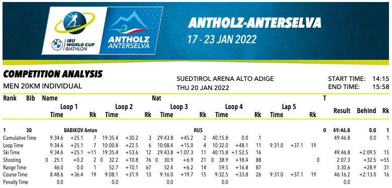
The competition analysis report, available directly from the IBU data center, combines all the time information per athlete per loop and combined:
Course data
Also important for some calculations described further down in this article is that we have a total course length for the event, and this includes the skiing tracks as well as the range section:
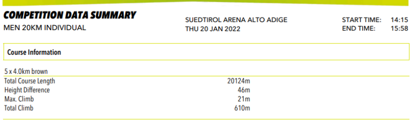
Unfortunately, we do not have data for just the skiing part of the track versus the range part of the track. But when we take into consideration that there typically are 30 lanes of 2.75-3m width, and the range includes 10m on either end, we can guesstimate that the range length is about 110m long. This is a very small part of the total course length (even for a sprint it is 1%). And since we don’t have a better alternative, the total course length is used in the calculations for some of the measures further down in this article.
Course map
The following image clarifies what parts of the racetrack are considered course time, range time and penalty time:
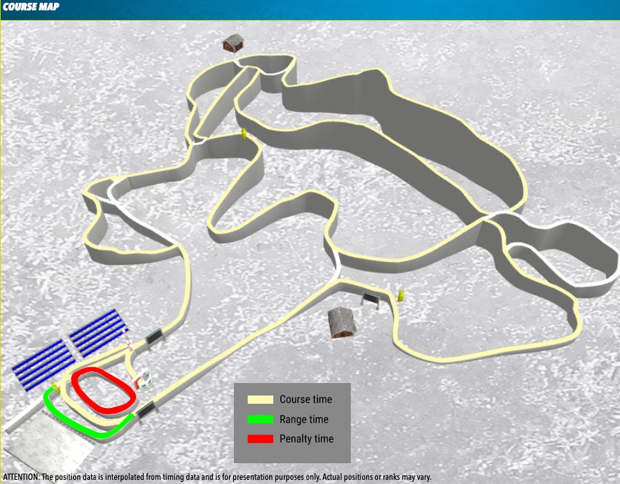
It should be noted that a small section of the penalty loop overlaps with the “normal” track, which explains why every athlete will have a couple of seconds of penalty time per loop, even if they shoot clean. Important to note here is that for ski speed in biathlon, we use only the course time data.
Time data, part II
All races have data for the total race time and the course total time, as well as the penalty time for all races except the individual race discipline which uses the ski time:
- Race time (above with the header “Finish”) typically called Loop time is the total time from start to finish, including range and penalty time;
- Ski time is the Race time minus the one-minute penalty times in individual races (other race disciplines do not have ski time data);
- Course time is the total time skiing, excluding time on the range and in the penalty loop. This is the data used for measuring how fast the athletes were skiing.
Measurements
The following is a list of measurements based on the data described above, currently used in the “biathlon world”. I try to give some pros, cons and comments on each of them.
- Seconds behind: absolute measure of the distance between athletes in seconds behind the fastest skier at the finish line
- Good way to show actual time distance between the athletes at the finish
- Doesn’t work well for aggregating multiple race disciplines as 10 seconds behind on the sprint is different than 10 seconds behind on the individual
- Seconds behind leader per 1,000 meter: absolute measure of the distance between athletes in seconds behind the fastest skier per 1,000 meters
- This normalizes the distance between athletes in seconds so it can be aggregated between multiple race disciplines
- Uses total course length to calculate
- Used by the IBU in biathlon information
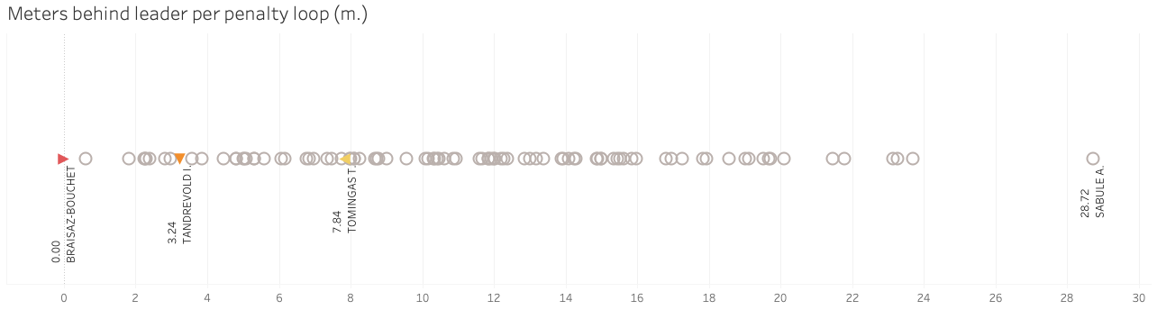
- Seconds behind per penalty loop: absolute measure of the distance between athletes in seconds behind the fastest skier per 150 meters, the length of a penalty loop
- Same as previous but normailzes to a distance people, both die-hard and occasional fans, can easily relate to
- Can be aggreated between multiple race disciplines
- Numbers can get very small
- Uses total course length to calculate
- Per cent behind, or per cent back: relative measure of the distance between athletes in a percentage of the ski time of the fastest skier
- Fastest athlete is always 0%
- There is no range for percentages; the slowest in one race can be +33% where in other races it can be 50%
- Per cent of average ski speed (of the whole field): relative measure of the distance between athletes in a percentage of the average ski time of all skiers
- Average ski time (0%) includes every athlete from best to worst
- You don’t really know how fast or slow someone is, as you don’t know the minimal and maximum percentage values
- The negative values (-3.4%) represent being faster than average so a positive result
- Per cent of the average of top 5/10/30 skiers: relative measure of the distance between athletes in a percentage of the average ski time of the top 5/10/30 skiers
- Average ski time can be focussed only on top 5/10/30 skiers
- This can level the field when comparing sprints (over 100 athletes) to mass starts (30 athletes)
- Meters behind leader: absolute measure of the distance between athletes in meters behind the fastest skier on the total course length at the finish line
- Apparently the way Siwidata now measures for the IBU
- Doesn’t work well for averaging multiple race disciplines as 10 meters behind on the sprint is different than 10 meters behind on the individual for example
- Meters behind leader per penalty loop: absolute measure of the distance between athletes in meters behind the fastest skier per 150 meters, the length of a penalty loop
- Same as previous but normailzes to a distance people, both die-hard and occasional fans, can easily relate to
- Can be aggreated between multiple race disciplines
- Numbers can get very small
- Uses total course length to calculate
- Ski speed: absolute measure of the difference between athletes in kilometres per hour
- Doesn’t say much about how the speed relates to time difference between athletes
- Has different effect on race depending on the race distance
- Ski speed rank: absolute measure of the difference between athletes in the rank in ski speed
- Fastest is rank 1, slowest is the highest number
- Downside is that it loses the actual distance between racers. One can be the third ranked skier by two seconds behind the leader or two minutes behind the leader
- Zscore: computed measure of the difference between athletes in the number of standard deviations by which course times are above or below the mean, based on seconds behind from median of all athletes
- Can be hard to relate to by all fans
- Although a precise value, only gives a general sense of someone being faster or slower than the field mean
- The negative values (-3.4%) represent being faster than average so a positive result
- Course time: absolute measure of the difference between athletes in the actual course times
- Gives a good idea of how long the athletes took to ski the track
- Need to calculate the actual differences
- Time behind score: relative measure of the difference between athletes on a 0-100% range, where fastest athlete is 100% and slowest is 0%
- Further explanation can be found in this post
Ways of communicating
Tables
All measures can be shown in a table, which provides a detailed overview of the race results per that specific measure. They are great for looking up specific athletes and giving the exact numbers, but they are harder to interpret quickly and to envision the fastest skiers and how far they are from each other.
Charts
Charts on the other hand are easy to interpret quickly while still proving detailed information per individual athlete (especially when created interactively), and context (see example at end of article) to make it even easier to read.
Description/talking
Probably the most complicated but least considered aspect of communicating ski speed is how it can be discussed. What does it mean when someone says Laegreid was -2,6% from the average, Latipov was 13 seconds behind, Boe was 16 meters behind, Lesser was 3% back, and so on? For die-hard biathlon fans this may make sense for those who are “into data”. For those who just love to watch biathlon and casual fans, I believe this way of describing ski speed is not very meaningful or useful.
Rankings are clear in the sense to discuss who was faster and slower, but not how much faster or slower. Measures per a relatable distance, like a penalty loop, are easy to understand and visualize for biathlon fans at all levels. They don’t even need to know the actual distance of a penalty loop!
Conclusion
When we take a look at most of the measurements in chart format, we can see that the majority show the same data but just with a different axis and units (the red, orange and yellow icons indicate rank 1, 10 and 30 respectively). And with all charts being equal we can decide which unit of measurement would be the easiest to communicate to all types of biathlon fans while having the ability to aggregate the data for a whole season.
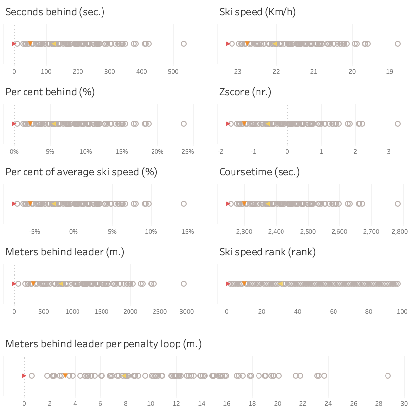
I already mentioned that although Seconds behind, Meters behind leader, and Course time are easy to relate to, they are not ideal for aggregation as race disciplines have different distances. The opposite is the case for Per cent behind, Per cent of average ski speed, and Zscore, as they aggregate well but are not so easy to relate to for all fans. The Ski speed in Km/h is cool in the sense that it makes you realize how fast these athletes go. But it doesn’t say much about the end result (difference between athletes) and it would be hard to aggregate.
Ski speed rank shows a different picture of the data when we put it in a chart. The ski speed rank is easy to relate to and very clear to communicate and aggregate, but it loses the information about the space between athletes.
For both single races and season aggregations, the Meters behind leader per penalty loop is a measure that is easy to understand for any biathlon fan, can be aggregated for a whole season with different race disciplines as it is normalized to a specific distance (150 meters), and it keeps the information on space between athletes intact. And on top of that, it can be visualized in cool ways.
It is also very similar to what the IBU currently uses (seconds behind per 1km) but I think that meters behind are easier to visualize mentally and understand than seconds behind and that it is good to use a distance people can relate to directly. The only downside to using the 150-meter loop is that athletes do appear very close to each other.
What is your preferred way of measuring ski speed? And do you agree or disagree with my comments above? Let’s have a conversation on Twitter, I’d love to hear other people’s perspectives.