real biathlon
    • Athletes
    • Teams
    • Races
    • Seasons
    • Scores
    • Records
    • Blog(current)
    • More
      Patreon Content Videos Explanations Shortcuts
      Error Report
      Privacy Policy About
    •     
  • Forum
  • Patreon
  • X
  • YouTube
    Instagram
    Facebook

Recent Articles

  • Junior + U23 Development Index – Men
  • Junior + U23 Development Index – Women
  • The Path to GOAT Status
  • Most improved athletes this winter
  • New biathlon point system

Categories

  • Biathlon Media
  • Biathlon News
  • Long-term trends
  • Statistical analysis
  • Website updates

Archives

  • 2024
    • March
  • 2023
    • March
  • 2022
    • December
    • June
    • May
    • March
    • February
    • January
  • 2021
    • December
    • November
    • September
    • July
    • June
    • May
    • April
    • March
    • February
    • January
  • 2020
    • December
    • November
    • August
    • June
    • March
  • 2015
    • December
  • 2013
    • August
    • July
  • 2012
    • July

Search Articles

Recent Tweets

Tweets by realbiathlon

Author: biathlonanalytics

Proud dad&husband; analyst & visualization specialist (Tableau, SQL & R); creator of Biathlon Analytics; blog poster on realbiathlon.com; passionate about biathlon, cross country skiing and canoeing

Historic biathlon results create expectations. But what about points?

Posted on 2022-06-15 | by biathlonanalytics

Introduction

The first article on the concept of the Win Expectancy Index based on Statistical Exploration, the introduction of W.E.I.S.E., explained the process and concept of win expectation. Using historic race results by athletes with variables identical to those of the athlete being analyzed, it calculated the percentage of wins. This gave us an idea of how likely it was for our athlete to win as well.

The second article on the topic gave you some examples of the possible use cases of the WEI.

After further developing the WEISE, this third article explains and demonstrates a new calculation using the same data and logic as the WEI. In this case, however, it does not look at the results binarily (winning or not winning), but rather at every result that awarded athletes with points*. The results of this calculation are summarized in the Expected Points Index (EXPI).

* see yellow box further down in the article

As a quick reminder, this is what the Win Expectancy Index looks like for all third laps of women’s sprint races (see the interactive version of the full WEI on Tableau Public):

Win Expectancy Index example
A female (W) athlete entering lap three of a SPrint race with 1 miss and ranked #3 in ski time, has a 20% chance of winning the race.

Version 2 of W.E.I.S.E.

One of the limitations of the Win Expectancy is that it only looks at the race results binarily: you either win a race or you do not win the race. But since World Cup races are rewarded with points we can use the same approach to calculate the EXpected Points (EXP).

This is a good time to remind you that W.E.I.S.E. uses calculated points based on calculated ranks, which can significantly differ from the ranks (and points) you find on the IBU website. All pursuit race results are (re)ranked based on the isolated times, thus ignoring the time differences at the start of the races which are based on the sprint race results. Also, in the season point totals, in addition to including points for Olympic Races, I do not deduct the points of the worst two races of the season, as is common in the IBU total standings. Lastly, all points are recalculated based on the current rules on awarding points as defined by the IBU.

EXpected Points

For all race participants in the last 22 seasons that were in the same race situation for cumulative misses and ski rank, we calculate the average of the points those athletes were awarded (link to interactive dashboard):

The Expected Points for lap three of Women’s Mass Start races, based on cumulative misses (top to bottom) and ski rank (left to right)

Again, like with the Win Expectancy, we can compare expected results with actual results. But now we can do so with far greater detail. Rather than saying “Eder had a 32% chance of winning after the second lap, but he didn’t win” we can now say “Eder could expecting 15 points after lap two, but got 18 points in the end”. And since we have this more detailed information at the points level, it allows us to calculate overperformance.

Overperformance

We simply subtract the EXpected Points on any lap during a race from the Actual Points (AP) at the end of that race. This measure tells us if the performance was above or below the expectation for every athlete. Overperformance is therefore defined as the actual points above the expected points. A negative value for overperformance simply indicates that the actual points were lower than the expected points. This can also be referred to as underperformance.

Let’s look at an example. In the image below, we have all races of the 2021-22 season for Julia Simon. Based on the overperformance calculation, we can see that she generally performed quite a lot better than expected:

Julia Simon has performed better than expected based on her last laps in all races in the 2021-22 season

When we turn this chart by 90 degrees and add lines for actual points (AP, green) and expected points (EXP, blue), it shows us Julia’s seasonal trend:

Again Julia Simon, comparing Actual Points (AP) to Expected Points (EXP) per final lap of the race
for the 2021-22 season (lines), and the overperformance (bars)

Running total of overperformance points

Now, rather than looking at the data race by race, let’s look at the overperformance cumulatively. Showing the running total of these values, we get a sense of how much Julia has overperformed this whole season. An amazing 120 points more than she could have expected based on historic results:

Same as above but with a running total of Over-and Under Performance based on final laps

Let’s move forward with that idea of the running total of overperformance points for the season. The following chart plots all female athletes of the 2021-22 season based on the total actual points (vertical axis) and the running total of overperformance points (horizontal axis):

Total actual points and running total of over-and under performance points for women’s final laps of races in the 2021-22 season

Based on this chart, Julia Simon, Dorothea Wierer and Lisa Hauser had the best total of overperformance points this season. They scored far more points than expected from historic results, based on their misses and ski rank going into the final lap of the races. Alina Stremous, Mari Eder and Vanessa Voigt were the worst overperforming athletes (aka underperformers) scoring much fewer points than expected.

Analyzing the past season, the athletes who overperformed did very well. Alternatively, when looking at the season ahead, athletes that underperformed last season could have expected to do better. So with some specific improvements over the summer, and perhaps some better luck, they may be able to make huge jumps next season if they can perform up to or above their expected points.

Season(s) averages and spread of overperformance

Per athlete, we can take the average of all the overperformances to see how they performed per season or over a specific timeframe. The other thing to look at is how large the difference was between their best overperformance and worst overperformance during that timeframe, the overperformance spread, or variance.

The last charts of this article shown below, also available interactively in the W.E.I.S.E. version 2 dashboard, show all athletes of the 2021-22 season plotted based on their average points overperformed per race (final laps only), and their overperformance spread:

Dorothea Wierer had an average of 4.56 point overperformance and an overperformance spread of 31.1

With overperformance it is fairly straightforward to determine good and bad: a positive overperformance is good (and the larger the better) and a negative one is not good, or at least leaves room for improvement. With the spread, it is a little less clear. As it is strictly based on the best and the worst overperformances during the selected season, it could be used, cautiously, as an indicator of consistency.

Another example. When we dig into Wierer’s data a little deeper, we can see that with an already strong average of +4.56 points of overperformance. Her average would be even better if the two negative outliers could be excluded. Did she perhaps brake a pole in the last lap of that individual race or had a fall in the last lap?

It will be up to Wierer and her team to figure out what happened in those two races to learn and improve. And for other athletes to find out how Wierer is so good at outperforming the expected points.

Dorothea Wierer had her best overperformance at 14.9 points above expected, and a worst of –16.2 overperformance, for a spread of 31.1

Conclusion and further development

In the first article on the Win Expectancy Index based on Statistical Information, I mostly focused on explaining the underlying data, processes and models, and the concept for the index itself. The second article gave some practical examples of the application of the index. This third article introduced an alternate and more detailed measurement based on the same concept: EXpected Points.

Tools like the W.E.I.S.E. are not suggested to eventually replace current and conventional wisdom, skill, expertise and knowledge in the field of biathlon. But it provides a different view based on actual data. And this is an approach not commonly and seriously used by many athletes and nations in the world of biathlon. Yet? Hopefully, articles like these will open some eyes to new possibilities that eventually, combined with, rather than instead of, current knowledge and expertise, will push biathlon athletes even further.

Thoughts or comments? You can find me on Twitter, or email me on the podcast Gmail account: PenaltyLoopPodcast

Posted in Statistical analysis | Tagged Expected points, W.E.I.S.E.

What do you expect? Practical applications of the W.E.I.S.E.

Posted on 2022-06-14 | by biathlonanalytics

Introduction

In my last article, the introduction of W.E.I.S.E., I introduced the process for creating the calculation of the expectation of winning, based on historic results with identical combinations of discipline, gender, race lap, the cumulative number of misses and cumulative ski time rank. After further developing the WEISE, this article demonstrates some practical uses of this Win Expectancy Index (WEI).

As a quick reminder, the interactive WEI dashboard can be found here and looks like this (with lap 3 selected):

Win Expectancy Index example
A female (W) athlete entering lap three of a SPrint race with 1 miss and ranked #3 in ski time, has a 20% chance of winning the race.

Examples of practical uses of the Win Expectancy Index

A tool like the Win Expectancy Index only makes sense if there is actual value in using it. Personally, I think it is very interesting to just look at the index, but I can imagine there are not too many people who share that passion for biathlon, data and data visualization. Below are some practical examples of how the Win Expectancy Index can be used to analyze athletes and races.

Athletes

Final lap Win Expectancy versus actual result

The conversion rate of opportunity to wins. For example, Elvira Oeberg’s conversion rate for races in which her Win Expectancy on the last lap was 33% or higher, was 60% (she won 3 of the 5 races).

Elvira race results in the 2021-22 season and Win Expectancy in the last lap of the race

Seasonal trend of average Win Expectancy per race for the final lap

This allows us to look at an athlete’s performance without the influence of the actual race results

The trend of JT Boe’s Win Expectancy in the final lap of every race

Average Win Expectancy per lap per discipline

Provides insight into a racer’s ability to balance their races well, and still perform well right to the final lap of a race

Looking at average Win Expectancy development per lap per athlete for sprint races

In this example, we are looking at all sprint races for women in the 2021-22 season. We then average each athlete’s Win Expectancy per lap. From this, we can see that for athletes like Roeiseland, Elvira Oeberg and Hauser the Win Expectancy increases towards the end of the race. On average, Sola, Alimbekava and Nilsson’s Win Expectancy declines in the last lap.

This gives athletes and coaches a tool to further analyse data at an individual race level to see if there is an issue or potential for improvement.

Races

Win Expectancy per race

How does the Win Expectancy change over the course of the race, and how did the eventual winner develop during the race?

Win Expectancy for athletes in the Women’s Sprint during World Cup 8 of the 2021-22 season

The trend of Win Expectancy per miss as ski rank increases

Here we can see that for athletes in the top-10 for ski rank, the difference in WE between 0 (dark green) or 1 (light green) miss is fairly consistent

Win Expectancy for all athletes in lap five of all five-lap-races with either
one (light green) or zero (dark green) misses as their race rank increases

The trend of Win Expectancy per ski rank (group) as misses increase

We can see here that the WE when skiing top-5 with one miss (~43%) is lower than when skiing top-10 with 0 misses (~49%)

Win Expectancy for all athletes in lap five of all five-lap-races with a ski rank as indicated by the labels as their race misses increase

Using Win Expectancy data to indicate some of the more exciting races

For biathlon viewers and fans, we can look at races where the highest value for Win Expectation (all athletes) during the race was 20% or less (a close pack). And within that group, the number of athletes that had that highest value of WE at some point during the race. If those numbers are 2 or more in sprint races or 4 or more in all other races, we then look at the final rank of the athlete(s) with the highest WE. If that was 10 or better we highlight the races with a pink star:

Based on this logic, the Women’s Sprint of World Cup 7 in the 2002-03 season would be interesting to watch (the highest WE of the race was only 14%, three athletes had that WE during the race and the highest rank of those three athletes was 9th). Or more recently, rewatch the 2019-20 World Cup 8 Women’s Pursuit (15%, 5 and #4).

Conclusion and further development

In the first article on the Win Expectancy Index based on Statistical Information, I mostly focused on explaining the underlying data, processes and models, and the concept for the index itself. This article dove into the application of the index by showing some examples of how it can provide value in analyzing the performances of athletes related to historic results with the same variables. I hope that this gives a better understanding of the concept of the WEI, and highlights its potential for performance analysis and athlete improvement based on a different, data-driven, view of biathlon performance.

Thoughts or comments? You can find me on Twitter, or email me on the podcast Gmail account: PenaltyLoopPodcast

Posted in Statistical analysis | Tagged Expected points, W.E.I.S.E.

Introducing W. E. I. S. E: the Win Expectancy Index based on Statistical Exploration, version 1

Posted on 2022-05-13 | by biathlonanalytics

Introduction

History

For many years, sports data analysts in numerous fields have used results from the past to predict outcomes of similar situations in the future with a specific level of certainty. In baseball, for example, one can foresee the outcome of an at-bat with specific parameters (2 strikes, 2 balls, 1 out, batting right, pitching left, and a score of 4-2 in the 7th inning) based on all similar situations in previous seasons of baseball. In (ice-)hockey one can do the same when looking at the shot location, the period and the current score with a specific goalie in the net, or the home-team win expectation based on a certain score and with a specific amount of time left in the game. All in all, there is a long history of using historical results to predict future ones. The article below takes a first stab at doing something similar for our beloved sport biathlon.

What is W.E.I.S.E.?

Since the end of the 2021-2022 season, I have been working on The Win Expectancy Index based on Statistical Exploration, W.E.I.S.E. or WEI for short. It uses results from previous biathlon races to predict with a level of certainty what the outcome of a race can be. Unlike baseball, and to some degree hockey, biathlon doesn’t offer its data ‘live’ during a race, but we can still use the WEI to analyze athletes’ performances while comparing predicted results and actual results, look at the strength and weaker points of an athlete during a race, and what component of the race to focus on, to name a few.

The WEI only just sprouted, and I’m already claiming quite the impact and outcome of it! Please don’t take me too seriously (but please, also don’t take me not serious at all). Although I highly value data and statistics in sports, I fully realize they are just one of the means that can be used for analyzing biathlon, and do not replace but rather enhance any other type of analysis. And outcomes are just predictions based on other events that, on paper, are the same, but in reality can be quite different, and as such, while providing value, should be taken with a few grains of salt.

Goal

My goal with the WEI and this article is to share my thoughts, describe the creation process and explain its possible applications. And by doing so I hope to get your interest and provide me with feedback. Yes, I am highly interested to hear your thoughts, know if you see any value in the WEI, and read about what thoughts you have when you read this! (fire me a tweet if you care to share!) In the end, I want to keep improving, updating and refining the WEI, and getting different perspectives will help that tremendously. And although it would sadden me after double-, triple- and quadruple checking everything, if you do find anything wrong or broken in the process described here or the index demonstrated further down, please do let me know.

Data

Basics

The basic data for this article are the individual race results on a participant level, as gathered by RealBiathlon, for all seasons starting in 2001-2002 up to and including 2021-2022. From all those races, the following results were excluded: Null (no values), DNF (did not finish), DNS (did not start), DSQ (disqualified), and LAP (lapped).

To give you an idea, we are talking about 1,068 races in total (136 individual, 200 mass starts, 328 pursuit and 402 sprint races. All these races had a combined total of 76,712 participants, 1,143,230 shots and 226,896 misses (19.8%).

Key statistics

For the first version of the WEI, I focus on two specific statistics that greatly impact the results of a biathlon race: ski speed, expressed in course time, and shooting, expressed in misses. Since I want to be able to look at win expectancy at every end of a lap (post-shooting) I calculated cumulative misses per lap and cumulative course time per lap which I then ranked.

(Re-)Calculations

I also (re-)calculated final race ranks and points, for a number of reasons:

  • First, I wanted to include Olympic Races for which no World Cup points are rewarded
  • Second, when using such a long time period, some point rewarding rules may have changed, so I wanted the points to reflect the current rules for awarding points
  • Third, as pursuit races can be heavily influenced by start times, I used the isolated times (actual race time ignoring start time differences) and calculated the final result rank and points.

Note that this last item can lead to odd-looking results, but please trust that the calculations are fine. For example, we know that Quentin Fillon Maillet won six pursuits in a row this season (including Olympics). However, his isolated results in those races were 5th, 2nd, 3rd, 14th, 3rd and 7th.

Data kaputt?

When looking at data for the 4th and 5th laps, some sprint races may appear to be broken. This is not the case but due to being the only discipline that only has two shootings and three laps. In the dashboard I share below I have made sure sprint races are not shown for laps four and five, but when more charts become available in the near future, you may see some oddities for laps four and five in sprint races. Now you know what causes it.

Unfortunately, some races are missing course time data for certain or all participants. This was likely due to broken time tracking equipment or ankle straps on the day of the race, or someone forgot to turn on the trackers, or something comparable. Since this data is actually ‘kaputt’, these results were removed from the dataset, as nulls can not be used in the calculations and counts (118 participants in total).

Analysis

Levels of detail

Based on the data described above, I wanted to create this first version of the WEI with cumulative misses and cumulative course time combinations, that possibly could be generalized in bins. As we are only able to look at results per lap, we don’t have the luxury of generating a huge number of historical results as they do in baseball for example. To ensure a decent sample size is available, grouping ski rankings in bins seemed to make sense. I also wanted to make sure that the resulting dashboards would allow users to look at the data as a whole, per gender and per discipline.

Calculating Win Expectancy

After organizing all the data in such a way that I had combinations of race/athlete/lap/cumulative misses/cumulative ski time rank, I could then calculate the total occurrences of these combinations, as well as the total number of race winners with those combinations.

For example, after the first lap, the most occurring combination was that of 535 participants with zero misses and ranked 13th in ski time, of whom 35 ended up winning the race. The Win Expectancy (WE) for that group would be 35/535 = 6.5%. Not surprisingly, the 501 participants without misses and ranking first in ski time after the first lap had the highest WE, with just under 30%. These WEs are still relatively low, as they are calculated after the first lap and shooting. A lot can still change, especially in the race disciplines that go five laps.

Reliability

The sprint races, only having three laps (while having the most participants), will have their most reliable WEs after lap three, when both their cumulative misses and ski time rank will no longer change. The athletes in all race disciplines with zero cumulative misses and ranked first in cumulative ski time after lap three have a 76.4% chance of winning (94 winners out of 123 athletes in total), based on historic results. If we look at athletes after lap three in sprint races only, the WE goes up to 89.6% (69 out of 77).

Sample sizes

The more specific we get with regards to race parameters, the fewer athletes and results we will have to compare to (smaller sample size). Especially when we look at mass starts, as those races already have a reduced number of athletes only starting 30 per race. For example, when we specifically look at the combination of the mass start discipline, women, one miss and ski time rank five, we will only find ten athletes (of whom two won, so the WE for that group is 20%). And as we go further down in misses and rank for that group, say for six misses and ski time rank 18, we only have four athletes.

Bins

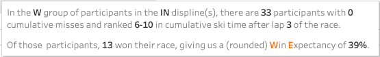
To address this we can use bins for the ski time rank, groups of values close together. So far I used bins with a size of five, combining all athletes from the same original group above (mass start, women, one miss) in ski time rank groups of 1-5, 6-10, 11-15, and so on. The ten athletes we found with one miss and ski time rank five are now in the group with one miss and ski time ranks 1-5, giving us 68 athletes including 27 winners, for a WE of 39.7%.

The W.E.I.S.E.

Now that I have introduced and described the creation of the W.E.I.S.E., let’s just have a look at it. Below is an interactive version of the Win Expectancy Index. Based on your input in the filters for Lap, Ski Rank or bin, Gender and Discipline, it shows the Win Expectancy for any combination of cumulative misses and cumulative-ski-time rank. If you hover your mouse over a data point it will show a pop-up with additional details, as shown below:

In case the embedded version below is not working or not displaying well on your screen, please go to the same dashboard on my Tableau Public site. If you’re not sure how to use the filters and such please see my previous post with some tips and tricks on how to use Tableau dashboards.

Applications of the W.E.I.S.E.

Examples

Now that you have a better understanding of the W.E.I.S.E. and an idea of what it looks like, the question arises: how does it add value? The following are examples of how I believe the W.E.I.S.E. can be used to better understand biathlon:

  • See what combinations of misses and ski time rankings have the best WE for each lap
  • Compare combinations for WE vs number of occurrences (probability vs reliability)
  • Compare the WE to actual race results and see how they relate or why they differ
  • See if the WE declines as ski time rank increases with the same number of misses
  • Reversed, see if the WE declines as the number of misses decreases while the ski time rank (bin) stays the same
  • For each lap in a race, analyze the changes in WE per athlete
  • Look for commonalities when doing the above for a number of races for a specific athlete to identify potential weak spots or strengths
  • Aggregate the WE per lap per race and compare races
  • Analyze if multiple and/or big changes in WE in a race relate to interesting races to (re-)watch
  • See if the aggregated WE can tell us anything on a nation’s level
  • Once live becomes available from the IBU, it can be used to see live updates on Win Expectation for any athlete, and even (although it’s definitely not my thing) use it for betting during the race
  • Change statistics to some that may better represent skiing and shooting
  • Develop this further to show expected points per combination rather than just the expectancy to win.

Share your thoughts, please!

That’s quite a list of things that I can just come up with after giving it some thought. But let’s not stop there! If you made it through the article all the way to here, please let me know (Twitter) your thoughts about the application of the W.E.I.S.E. and your ideas on how to improve and expand it in the next version. If you’re not on Twitter, I’m also on Instagram and you can also email me (just add rj@ in front of my main website name). I would really appreciate your time and attention. I have plans to embed some of the ideas above in newer versions of W.E.I.S.E. in the following weeks, but new perspectives really help in improving it, so I’m looking forward to your feedback and the conversations!

RJ

Posted in Long-term trends, Statistical analysis | Tagged W.E.I.S.E., Win Expectancy

Peak age for biathletes at the World Cup level

Posted on 2022-05-07 | by biathlonanalytics

Introduction

A couple of weeks ago, just as I was finishing up my analysis on the strength of biathlon nations, there was an article* on FasterSkier about Trends in Age and Ski Performance, for cross country skiers on the FIS World Cup. Curious about what this would look like for biathlon, I did some data digging to get race results as well as athlete birthdays to calculate their ages on race day. And then I got distracted and forgot about it. Luckily Matthias Ahrends, a super friendly biathlon coach from Canmore sent me an email about the article and asked if that was something I could look into for biathlon. Yes, I can! And I did.

Trends in Age and Ski Performance: A Second Look by Ella DeWolf and Andrew Siegel

* The original article, Analysis: Performance and Age, was written by Joran Elias, also known as StatisticalSkier

Data

The data for all the used non-team race results (World Cup level, including Olympic Games) and biathletes is from the 2009-2010 season up to and including the 2021-2022 season. This includes 1,102 athletes, 658 races, 47,458 race participants and 5,129 age-athlete combinations varying from 16 to 48 years old. Unfortunately, two athletes’ birthdays are incorrect in the data source (Romana Schrempf and Andreea Mezdrea) leading to incorrect age calculations, so they have been excluded.

The ages of athletes were calculated at the race level, based on their birthdays and the race date.

The biathlon performance is based on points that were calculated for all races, including Olympic ones, based on race rankings according to the current IBU rule book. For pursuit races, I calculated points based on the isolated race results (ignoring start time differences) as that gives a better indicator of performance.

Recent retroactive disqualifications by the IBU excluded the involved athletes from the rankings and moved up all lower-ranked athletes one position in the rankings.

Total points per age per athlete

Following the article, we first look at the total (calculated) points per athlete, one age at a time, which shows at what age athletes score the most points. The ages are shown from left to right, and the points from bottom to top.

We can see in the chart that women scored the highest number of points in the ages just after turning 30. One thing to consider is that typically the more successful athletes may be able to continue their successes a little longer, which could explain why the peak in total points is rather late. As we can see from the confidence band, the confidence of the trendline is lower as we get to higher ages, as it is based on fewer athletes.

The male athletes show a similar pattern, with the peak of most points around the age of 33. These are just the total number of points scored at a certain age for every athlete, not considering the total number of athletes and races in that age group. In case you are wondering about the single, fairly high line on the right of the chart? I call it the OEB effect. Ole Einar Bjørndalen affected the trendline quite substantially, specifically at higher ages.

Average points per athlete per age

The next chart shows the same data as above but averages the points per age per athlete. The darker areas indicate overlapping athlete-age combinations. The peak of the average scores happens around the early 30s again, with slightly higher averages by the women compared to the men. This is possibly caused by the larger number of male athletes, as shown a few charts down.

Number of seasons

Still following the structure of the mentioned cross country skiers article, I looked at the number of seasons the athletes participated in. When looking at this chart, please keep in mind that although it is still useful, it provides an incomplete picture. Although the data starts in the 2009-2010 season, not all athletes represented in the data started their first year in that season. The athletes that were active before the 2009-2010 season will be shown as if they started their first season in 2009-2010. For example, Ole Einar Bjørndalen raced from 1993 until 2018, an incredible 26 seasons. But he will show up in this chart as an athlete with nine seasons (2009-2010 until 2017-2018).

We can see that a large proportion of the dataset only races in a few seasons. The ones that race for ten seasons or more represent about 8.5% of the total dataset.

Stats overview

When combining all points from all athletes per age, we see that women score the most points at age 26, and men at 28.

The highest number of athletes peaks a bit earlier, at age 23 and 24 for women and men.

The average points per athlete per age follow a fairly smooth pattern until age 30, after which the impact of some major athletes disrupts it. Women athletes like Kaisa Makarainen, Andrea Henkel, Olga Zaitseva and Anastasiya Kuzmina still scored a lot of points at age 34, and Ole Einar Bjørndalen still produced 730 points at age 41, and 431 at age 43! Those point totals combined with very few athletes still racing at those ages leads to high point averages per athlete per age.

When we look at the number of races athletes participated in per age, we see a plateau of about 320 races up to age 32, 33 after which they start dropping quite quickly. The sudden uptake amongst the women at age 37 is thanks to athletes like Magdalena Gwizdon, Anna Carin Zidek, Andrea Henkel, Susan Dunklee and Selina Gasparin. Some of the most active men in their 40s are Ole Einar Bjørndalen, Ilmars Bricis, Daniel Mesotitsch, Halvard Hanevold and Oystein Slettemark.

The number of participants per age peaks around 25 and levels off pretty fast after that. When dividing the total points per age by the number of race participants we see quite similar trends to the average-points-per-athlete chart. Ole Einar Bjørndalen and Halvard Hanevold are mostly responsible for the high levels at 40 and up.

Concluding

I think the analysis above confirms the general assumption that biathletes typically perform at their strongest between the early and mid-30s, with some exceptional male athletes still performing at high levels in their 40s. Although that, with all respect to the other athletes, can be mostly contributed to the OEB effect.

Did you like this article, or do you have questions or comments? Please reach out on Twitter!

Posted in Biathlon News, Statistical analysis

Who were the best performing biathletes at the Beijing Olympics?

Posted on 2022-03-02 | by biathlonanalytics | Leave a Comment on Who were the best performing biathletes at the Beijing Olympics?

Introduction

This article accompanies the Tableau Public dashboards I created to highlight those athletes who performed better than their season average at the Olympic Winter Games in Beijing, and look at those below their average.

Data

The data used for this analysis are all from the race analysis reports from the non-team IBU races in the 2021-2022 season up to and including the Olympic Winter Games in Beijing. The data was then split into two groups. The Olympic Games races, and the races during the first two trimesters of the season. After averaging the performances per group, the two groups were then compared.

I would like to note that the data for the Olympic games is based on four races or less. This is a very small sample size to use for averages that show Olympic performances. While some of these performance differences can be explained by (bad) luck on an individual level, at the nation or gender level the averages will eliminate or at least significantly reduce this luck factor.

Performances

This analysis looks at which athletes over- or underperformed compared to their statistics in the first two trimesters of the IBU World Cup, rather than at their overall performance at the Olympics. For example, while Justine Braisaz-Bouchet went home with a gold medal, on average she was slower and shot a lower percentage than her first two trimesters.

The Skiing performance is expressed in the average seconds behind the leader per 1,000m. The calculation uses the total course length as provided on the IBU Biathlonresults.com webpage. Please note that by using this metric we also get a sense of how much the field was spread out, as it looks at the seconds behind the leader.

The Shooting performance uses the average total shooting percentage (prone and standing combined).

As the values for both skiing and shooting performances differences were in the same range I added a Combined difference of the two. A negative skiing performance and positive shooting performance are considered improvements. Therefore the calculation is [Shooting performance] – [Skiing performance].

Field

Before jumping into the individual results it is a good idea to look at the averages for men (blue circle), women (orange triangle) and everyone combined:

From these numbers, we can assume that both the skiing conditions as well as the shooting conditions were tougher than the average conditions during the first two trimesters as all athletes combined were (on average) 2.4 sec./1,000m slower and shot 1.7% worse. This aligns with what we have seen and read about the Olympic races being very tough.

Tableau dashboards

I encourage you to have a look at the table and charts on Tableau Public page I created for this analysis. It allows you to filter the data and will show you additional information by hovering over the data points. It will also allow you to see more details and information than described below. The screenshots used in this article are taken from the same dashboards.

Link to Tableau Public page

Men

When looking at the men’s performances for all athletes that raced all four non-team events (you can change this in the interactive dashboards), the Canadian Jules Burnotte had the best performance improvement during the Olympics. He had basically the same ski speed and shot 7.25% higher than in the first two trimesters. Martin Ponsiluoma, Dominik Windisch, Roman Rees, Quentin Fillon Maillet and Tarjei Boe were also better (on average) compared to their first two trimesters.

Sturla Holm Laegreid on the other hand had the worst performance, seeing his shooting percentage drop by over 18% and skiing just a tiny bit slower. Emilien Jacquelin and Alexandr Loginov probably also had hoped for better individual performances.

There were only two male athletes with four races that improved their skiing performance: Artem Pryma from Ukraine, and Johannes Thingnes Boe from Norway. And they only shaved off 0.6 and 0.2 seconds per 1,000m respectively (but keep in mind the average for men was 2.9 seconds/1,000m slower). Emilien Jacquelin, Sebastian Samuelsson and Felix Leitner lost the most speed, with more than five seconds/1,000m.

When looking at all athletes, regardless of how many races they participated in, Raido Raenkel from Estonia (3 races) was 1.14 sec./1,000m slower but shot 17.5% better, for a combined improvement of 16.36, the best of the field. He was closely followed by Matej Baloga and Sebastian Stalder.

Women

On the women’s side, the best performance improvement came from Katharina Innerhofer from Austria (only including athletes with all four races). She was almost a second faster and shot 15% better. Yuliia Dzhima, Paulina Fialkova, Lucie Charvatova, Tiril Eckhoff, Denise Herrmann, Marte Olsbu Roeiseland, Deedra Irwin and Elvira Oeberg were the other female athletes who improved compared to the first two trimesters.

Hanna Oeberg, Uliana Nigmatullina and Anias Bescond had the largest combined decrease in performance.

There were actually 13 athletes who improved their skiing performances during the Olympics, with not the much-discussed athlete Tiril Eckhoff making the biggest improvement, but Deedra Irwin (3.8 sec./1,000m) from the USA. Lucie Charvatova on the other hand lost just over 5 sec./1,000m.

The same Charvatova, and Kathariana Innerhofer improved their shooting the most, by 12.4 and 15% respectively, while Anias Bescond, Hanna Sola and Uliana Nigmatullina had the biggest drop in shooting percentage (13, 14 and 17.3%).

For all athletes, ignoring the number of races they participated in, the best improvement was by Maria Zdravkova from Bulgaria (2 races), who was 0.45 sec./1,000m faster and shot 17.5% above her pre-Olympic season average. Innerhofer (4 races) and Erika Janka from Finland (1 race) were close behind.

The athletes in the top right corner improved both in skiing and shooting. The bottom left corner has a decrease in both:

Nations

The performance improvement results for nations, split by gender, are based on all athletes that participated for a nation in non-team events, regardless of the number of races they participated in. This should be kept in mind when looking at nations like Denmark&Greenland women and New Zealand men (2 races total for both), or Sweden (women) and Germany (men) with 16 races. For the following paragraphs, I only looked at nations that had 8 or more races in total (half of the max. number of races possible).

Since we are only looking at the nation’s average, the results don’t say anything about how spread out the individual results were within the team, and this can strongly vary between teams. The averages were calculated by averaging all the nation’s athlete’s race results, rather than averaging the athlete’s averages per nation and gender.

Women

The top 6 nations on the women‘s side all had an improvement: Ukraine, Norway, Slovakia, USA, Japan and Finland. All other nations had a decrease in combined performance, with France having the worst combined performance improvement followed by Canada, Russia, Belarus and China. Norway improved most in skiing, and Ukraine in shooting.

Men

Moving over to the men‘s side, there were only four nations that improved on their combined performance: Slovakia, China, Canada and Switzerland. The worst combined performances were from Belgium, Finland, Belarus, USA and Russia. The biggest improvers in skiing were China, Canada, Russia and Norway, while Slovakia, China Switzerland, Estonia, Canada, Bulgaria and Italy were the only nations that improved their shooting performance.

When we look at a combined overview we can see that overall women made bigger improvements than men:

Again, I encourage you to check out these visuals interactively on Tableau Public, specifically the ones used above: Athletes Table, Athletes Chart and Nations Chart.

Cheers!

Posted in Statistical analysis | Tagged Beijing 2022, Olympic Winter Games

Posts navigation

Older posts

Recent Articles

  • Junior + U23 Development Index – Men
  • Junior + U23 Development Index – Women
  • The Path to GOAT Status
  • Most improved athletes this winter
  • New biathlon point system

Categories

  • Biathlon Media
  • Biathlon News
  • Long-term trends
  • Statistical analysis
  • Website updates

Archives by Month

  • 2024: J F M A M J J A S O N D
  • 2023: J F M A M J J A S O N D
  • 2022: J F M A M J J A S O N D
  • 2021: J F M A M J J A S O N D
  • 2020: J F M A M J J A S O N D
  • 2015: J F M A M J J A S O N D
  • 2013: J F M A M J J A S O N D
  • 2012: J F M A M J J A S O N D

Search Articles