Introduction
The first article on the concept of the Win Expectancy Index based on Statistical Exploration, the introduction of W.E.I.S.E., explained the process and concept of win expectation. Using historic race results by athletes with variables identical to those of the athlete being analyzed, it calculated the percentage of wins. This gave us an idea of how likely it was for our athlete to win as well.
The second article on the topic gave you some examples of the possible use cases of the WEI.
After further developing the WEISE, this third article explains and demonstrates a new calculation using the same data and logic as the WEI. In this case, however, it does not look at the results binarily (winning or not winning), but rather at every result that awarded athletes with points*. The results of this calculation are summarized in the Expected Points Index (EXPI).
* see yellow box further down in the article
As a quick reminder, this is what the Win Expectancy Index looks like for all third laps of women’s sprint races (see the interactive version of the full WEI on Tableau Public):
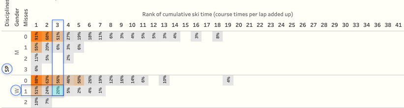 Win Expectancy Index example
A female (W) athlete entering lap three of a SPrint race with 1 miss and ranked #3 in ski time, has a 20% chance of winning the race.
Version 2 of W.E.I.S.E.
One of the limitations of the Win Expectancy is that it only looks at the race results binarily: you either win a race or you do not win the race. But since World Cup races are rewarded with points we can use the same approach to calculate the EXpected Points (EXP).
This is a good time to remind you that W.E.I.S.E. uses calculated points based on calculated ranks, which can significantly differ from the ranks (and points) you find on the IBU website. All pursuit race results are (re)ranked based on the isolated times, thus ignoring the time differences at the start of the races which are based on the sprint race results. Also, in the season point totals, in addition to including points for Olympic Races, I do not deduct the points of the worst two races of the season, as is common in the IBU total standings. Lastly, all points are recalculated based on the current rules on awarding points as defined by the IBU.
EXpected Points
For all race participants in the last 22 seasons that were in the same race situation for cumulative misses and ski rank, we calculate the average of the points those athletes were awarded (link to interactive dashboard):
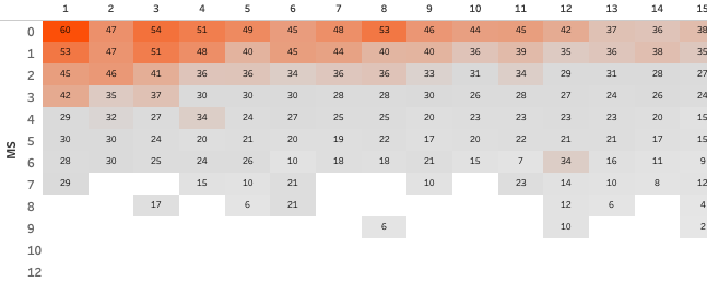 The Expected Points for lap three of Women’s Mass Start races, based on cumulative misses (top to bottom) and ski rank (left to right)
Again, like with the Win Expectancy, we can compare expected results with actual results. But now we can do so with far greater detail. Rather than saying “Eder had a 32% chance of winning after the second lap, but he didn’t win” we can now say “Eder could expecting 15 points after lap two, but got 18 points in the end”. And since we have this more detailed information at the points level, it allows us to calculate overperformance.
Overperformance
We simply subtract the EXpected Points on any lap during a race from the Actual Points (AP) at the end of that race. This measure tells us if the performance was above or below the expectation for every athlete. Overperformance is therefore defined as the actual points above the expected points. A negative value for overperformance simply indicates that the actual points were lower than the expected points. This can also be referred to as underperformance.
Let’s look at an example. In the image below, we have all races of the 2021-22 season for Julia Simon. Based on the overperformance calculation, we can see that she generally performed quite a lot better than expected:
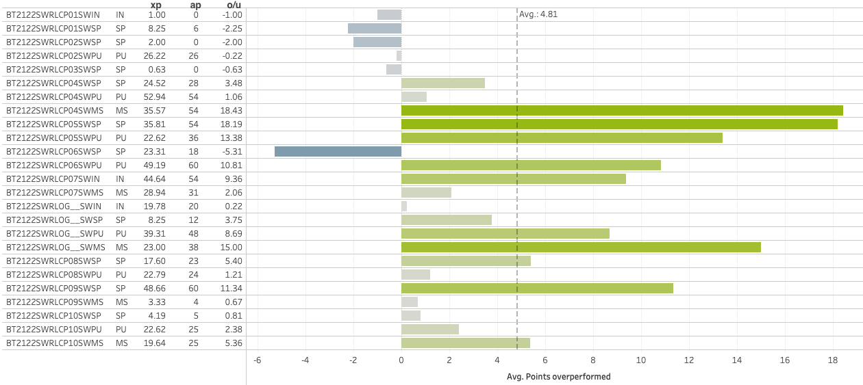 Julia Simon has performed better than expected based on her last laps in all races in the 2021-22 season
When we turn this chart by 90 degrees and add lines for actual points (AP, green) and expected points (EXP, blue), it shows us Julia’s seasonal trend:
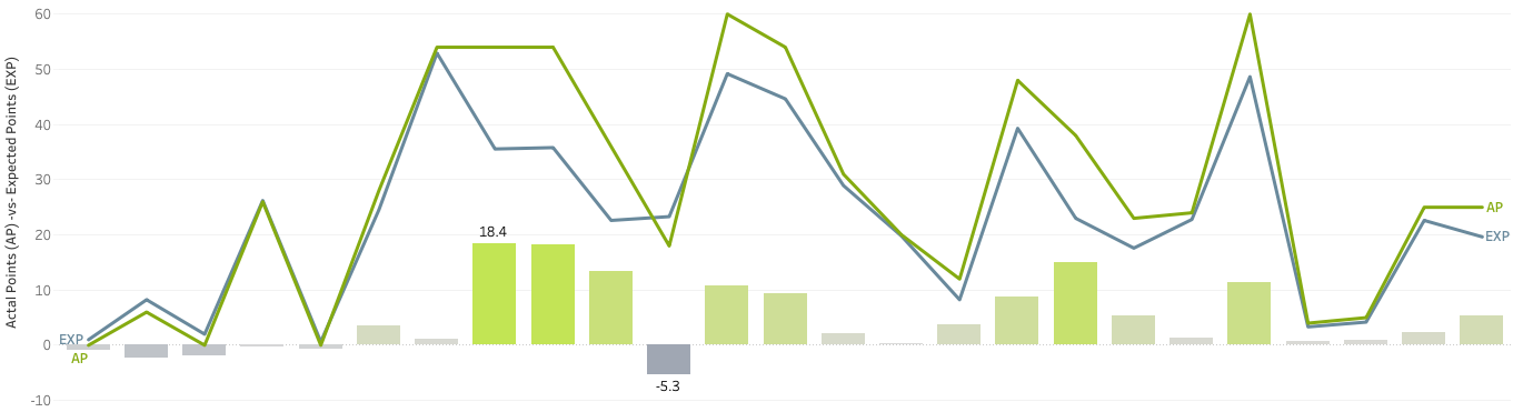 Again Julia Simon, comparing Actual Points (AP) to Expected Points (EXP) per final lap of the race
for the 2021-22 season (lines), and the overperformance (bars)
Running total of overperformance points
Now, rather than looking at the data race by race, let’s look at the overperformance cumulatively. Showing the running total of these values, we get a sense of how much Julia has overperformed this whole season. An amazing 120 points more than she could have expected based on historic results:
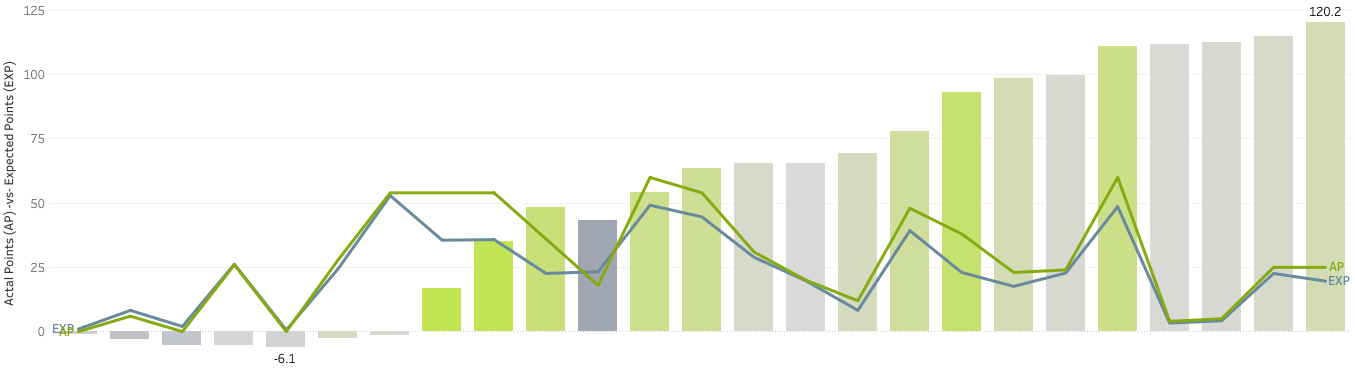 Same as above but with a running total of Over-and Under Performance based on final laps
Let’s move forward with that idea of the running total of overperformance points for the season. The following chart plots all female athletes of the 2021-22 season based on the total actual points (vertical axis) and the running total of overperformance points (horizontal axis):
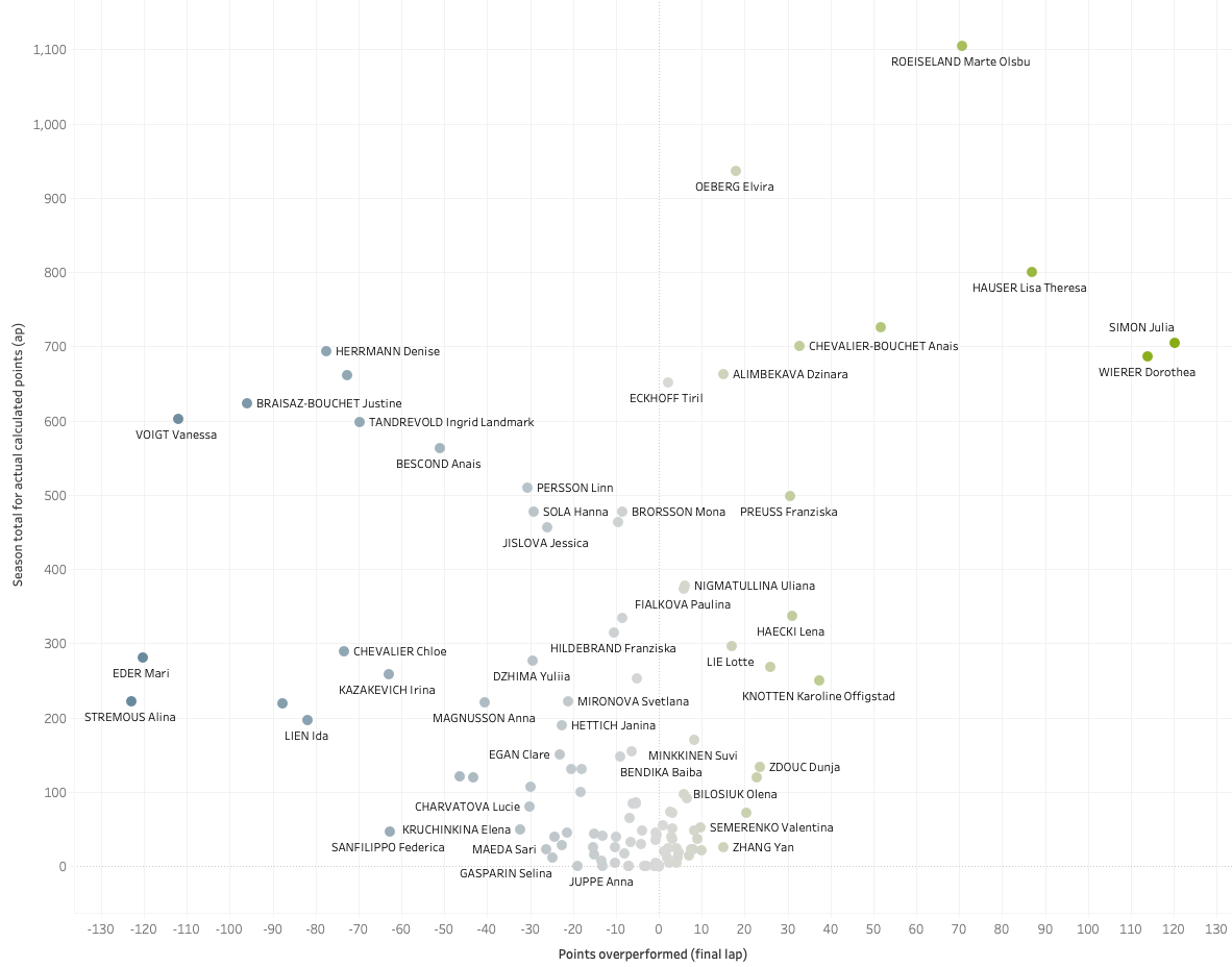 Total actual points and running total of over-and under performance points for women’s final laps of races in the 2021-22 season
Based on this chart, Julia Simon, Dorothea Wierer and Lisa Hauser had the best total of overperformance points this season. They scored far more points than expected from historic results, based on their misses and ski rank going into the final lap of the races. Alina Stremous, Mari Eder and Vanessa Voigt were the worst overperforming athletes (aka underperformers) scoring much fewer points than expected.
Analyzing the past season, the athletes who overperformed did very well. Alternatively, when looking at the season ahead, athletes that underperformed last season could have expected to do better. So with some specific improvements over the summer, and perhaps some better luck, they may be able to make huge jumps next season if they can perform up to or above their expected points.
Season(s) averages and spread of overperformance
Per athlete, we can take the average of all the overperformances to see how they performed per season or over a specific timeframe. The other thing to look at is how large the difference was between their best overperformance and worst overperformance during that timeframe, the overperformance spread, or variance.
The last charts of this article shown below, also available interactively in the W.E.I.S.E. version 2 dashboard, show all athletes of the 2021-22 season plotted based on their average points overperformed per race (final laps only), and their overperformance spread:
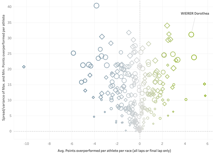 Dorothea Wierer had an average of 4.56 point overperformance and an overperformance spread of 31.1
With overperformance it is fairly straightforward to determine good and bad: a positive overperformance is good (and the larger the better) and a negative one is not good, or at least leaves room for improvement. With the spread, it is a little less clear. As it is strictly based on the best and the worst overperformances during the selected season, it could be used, cautiously, as an indicator of consistency.
Another example. When we dig into Wierer’s data a little deeper, we can see that with an already strong average of +4.56 points of overperformance. Her average would be even better if the two negative outliers could be excluded. Did she perhaps brake a pole in the last lap of that individual race or had a fall in the last lap?
It will be up to Wierer and her team to figure out what happened in those two races to learn and improve. And for other athletes to find out how Wierer is so good at outperforming the expected points.
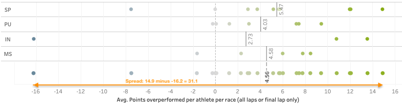 Dorothea Wierer had her best overperformance at 14.9 points above expected, and a worst of –16.2 overperformance, for a spread of 31.1
Conclusion and further development
In the first article on the Win Expectancy Index based on Statistical Information, I mostly focused on explaining the underlying data, processes and models, and the concept for the index itself. The second article gave some practical examples of the application of the index. This third article introduced an alternate and more detailed measurement based on the same concept: EXpected Points.
Tools like the W.E.I.S.E. are not suggested to eventually replace current and conventional wisdom, skill, expertise and knowledge in the field of biathlon. But it provides a different view based on actual data. And this is an approach not commonly and seriously used by many athletes and nations in the world of biathlon. Yet? Hopefully, articles like these will open some eyes to new possibilities that eventually, combined with, rather than instead of, current knowledge and expertise, will push biathlon athletes even further.
Thoughts or comments? You can find me on Twitter, or email me on the podcast Gmail account: PenaltyLoopPodcast