real biathlon
    • Athletes
    • Teams
    • Races
    • Seasons
    • Scores
    • Records
    • Blog(current)
    • More
      Patreon Content Videos Explanations Shortcuts
      Error Report
      Privacy Policy About
    •     
  • Forum
  • Patreon
  • X
  • YouTube
    Instagram
    Facebook

Recent Articles

  • Junior + U23 Development Index – Men
  • Junior + U23 Development Index – Women
  • The Path to GOAT Status
  • Most improved athletes this winter
  • New biathlon point system

Categories

  • Biathlon Media
  • Biathlon News
  • Long-term trends
  • Statistical analysis
  • Website updates

Archives

  • 2024
    • March
  • 2023
    • March
  • 2022
    • December
    • June
    • May
    • March
    • February
    • January
  • 2021
    • December
    • November
    • September
    • July
    • June
    • May
    • April
    • March
    • February
    • January
  • 2020
    • December
    • November
    • August
    • June
    • March
  • 2015
    • December
  • 2013
    • August
    • July
  • 2012
    • July

Search Articles

Recent Tweets

Tweets by realbiathlon

Category: Long-term trends

Canadian biathletes finding balance

Posted on 2021-04-06 | by biathlonanalytics | Leave a Comment on Canadian biathletes finding balance

With three top 10s, sixteen top 20s and twenty-five top 30s in individual events, the 2020-2021 season was the best Canadian season in the last five years. After a dip in total World cup points in the 2019-2020 season, last season continued on the five-year trend of continuous increase in total world cup points:

So what did Canada do well to get here, and where is there still room for improvement? That is what the following review of the Canadian individual performances in the 2020-2021 season will analyse! In this analysis, I will only show some examples of Canadian performances, but a supportive dashboard with all used data for this analysis can be found on my Tableau Public page. It shows all stats for the Canadian team, both men and women, and has a second tab where a Canadian athlete can be selected to show his or her specific stats.

Skiing time

The skiing is still the area where the Canadian team overall can gain the most time. In the specific example below I compare the average ski times of the Canadian athletes to the field average, the average of the top 30 athletes, and the average of the top 10 athletes:

Although we can see Canada is closing up the gap a little compared to last season, we are still behind the overall average, and far behind the top 10 athletes. But the positive news is that we made great progress in the 2020-2021 season, indicated by the steep drop towards the averages.

Shooting time

This is where Canada has the least to gain (and the most to loose) as we continue to be very strong in fast shooting, leading many of the true biathlon nations:

Shooting accuracy

In previous seasons the fast shooting times by the Canadians often lead to less desired shooting percentages, but it appears the team and coaches are starting to find a balance between shooting fast and shooting accurate, demonstrated by both increased accuracy in Prone and Standing:

Shooting speed -vs- Accuracy

This balance between shooting fast and clean is of course the golden grail of shooting in biathlon (I wrote about this in more depth on this website in December last year). The chart below shows how this balance has changed for the different team, starting in 2016-2017 (thin line) and how teams have moved from shooting more or less accurate, and faster or slower. We see that in 2018-2019 team Canada put a lot of focus on shooting faster, which worked, but at the expense of less accuracy. Now we see that we have lost some speed (but are still very fast) but have gained accuracy. Hopefully, this trend can continue upwards towards more accuracy while remaining fast.

Individuals

The second part of the evaluation is looking at the individual athletes. All Canadian athletes can be viewed on the interactive dashboard, but here I’m letting Emma Lunder be the example here. We can see that here Accuracy -vs- Speed trend is similar to the Team’s and that she is gaining accuracy while giving up a little speed. But we can also see that here range, shooting and prep time (prep = range – shooting) is still very good and well below the field’s average:

Her total percentage of shooting accuracy (T) has increased mostly based on a strong increase in her prone shooting (P) and she well above the field’s average Total shooting percentage (T avg.). Lastly her skiing speed seems to have stabilized and is on par with the field’s average. But she is also closing the gap with the Top 30 and Top 10 averages.

Conclusion

As mentioned team Canada had a great season, as did Emma Lunder. The above will hopefully give a good explanation of how to read the interactive dashboard to see both men’s and women’s team performances for individual races, and the individual dashboards for any of the Canadian athletes. If the current trends continue and with some of the younger athletes coming through the pipeline, hopefully, we can some Canadian podiums in the next season! Go Canada!

Posted in Biathlon Media, Long-term trends, Statistical analysis

When to start (in an interval start race)?

Posted on 2021-02-17 | by biathlonanalytics | Leave a Comment on When to start (in an interval start race)?

This is a research project about when to start in individual and sprint races based on impact of conditions. I wanted to see in the data if starting early or late in the race had a positive or negative impact on the skiing and shooting of competitors.

For skiing I will use the Z score, and compare the athletes’ season average score to their actual race score, per athlete bib. This gives a much fairer number as strictly looking at the Z score per athlete, the skiing ability comes into play. When comparing to the season average of the athlete, you can say, regardless of skiing ability, if an athlete was faster (neg. or slower (+) than his or her average.

I also added the three weather data points at the start, after the start (+30 min.) and at the end of the race, around +80 minutes. like so:

The logic of the weather timing is a follows: “at the start” is time 0, or when the first athlete leaves. “After the start” is 30 minutes after the start of the race. In 30 minutes 60 athletes will start (half-minute intervals), and about 30 of them will spend most of their time in “at the start” weather. The the “at the start” group is bibs 1-30. Then the last measure point is when the last athlete finishes, so quite a bit later, depending on the type of race. On average I’d say bibs 31-80 spend most of their time in the “after the start” weather, and after that, they spend the most time on the “finish” weather.

So to see how every athlete performed compared to their season average, I subtracted the season value from the actual race value; any score above zero means slower than season average, and anything below would be faster than season average:

But this is still not giving much information, just lots of data. So to simplify and aggregate some data I looked at the bib numbers of athletes that fall into the different weather groups:

Well, it’s telling us more but perhaps a little to aggregated? Also we should have a look at the axis, as this image suggests large differences, the at the start group is only 0.0859 faster than season average, so the actual impact in this race example is actually very small.

To get to a detail level somewhere in between, I grouped the athletes by 10s of bib numbers, 1-10, 11-20, 21-30, etc., both for the Actual vs season average and the delta where I average the 10 athletes within each group:

This level of detail looks about right, here we can generally see the “weather groups” but still have a bit more details. The average lines also provide useful information when comparing the three weather groups, or the bib groups within a weather group.

Now we can do the same for Shooting Z Scores:

Now that you have read this please play with the dashboard located on Tableau Public and see where the starting bib combined with conditions had a positive or negative impact on the athletes.

Posted in Long-term trends, Statistical analysis

Predicting the World Championships in Pokljuka

Posted on 2021-02-06 | by biathlonanalytics | Leave a Comment on Predicting the World Championships in Pokljuka

One of the reasons I really love biathlon is that it is unpredictable. Yes, there are favourites who win more regularly than others, but there are always a large number of athletes who can take the win. Yet my next Tableau Dashboard is called Pokljuka Predictions. Well, I ran out of space to add “well, not really”. But to make predictions to the best of one’s ability, having all the right information in front of you is the best option you have. And that is what this dashboard is supposed to do: provide useful information that allows making the best possible prediction.

The dashboard works per Race Category (gender) and Race Discpline. After selecting these two parameters we can have a look at the charts but first, let’s look at some info on the events.

They are held in Slovenia, at the Pokljuka Biathlon Stadium

The program is a busy one for the athletes, but this report excludes the relays.

After setting the filters, three of the four “columns” show data, where the central column at the bottom shows data when an athlete is selected.

The scatterplot shows the athletes related to their last race in Pokljuka in this Discipline and their current standing in the World Cup for this discipline. X’s mean that the athlete either did not participate in the most recent Pokljuka event, or is not in the current season Discipline Standings. It gives an idea of what athletes are good this season and did well in the last race in Pokljuka for this discipline. They will show up in the top right.

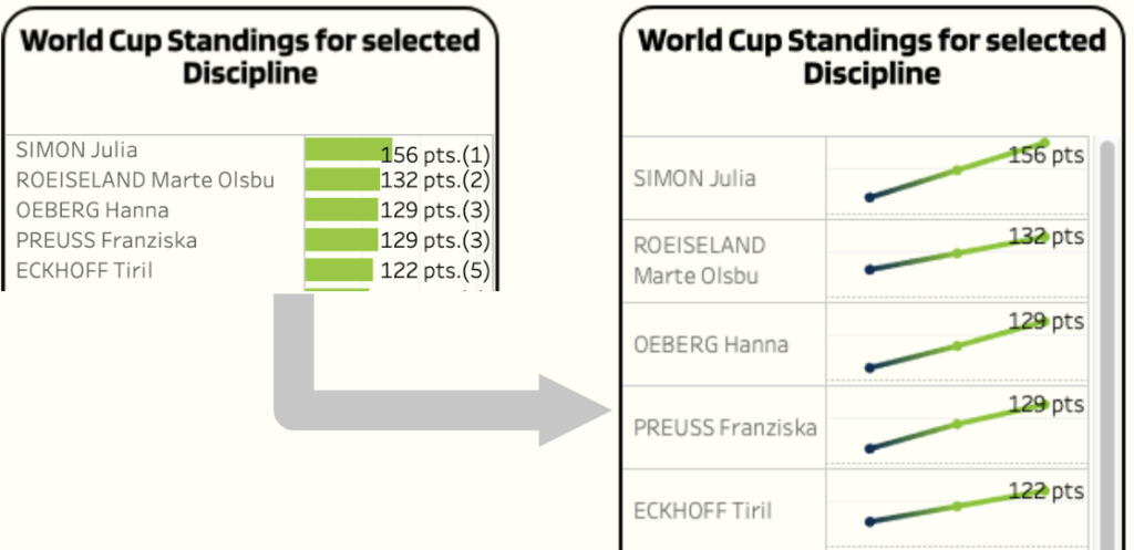
The following two charts show similar data from above but individually: the race results for this discipline in previous seasons (when available), and the current World Cup standings for this discipline with points and ranking in brackets.

When selecting an athlete in any of these charts, we can see the current season results in the selected discipline for the selected athlete, compared to their career (since the 16-17 season) average (dark blue dashed line) and the current season’s average (light blue dotted line).

This is followed by the athlete’s current form based on consistency;it shows the absolute change in rankings per season, so the higher the value (lower on the chart), the larger the inconsistency. And the steepness of the decline shows the athlete’s form. Steep points to a big change in results, where a almost flat decline indicates that recent results were similar. It does not indicate however if these results were high or low in the ranking. If an athletes was 45th, 43rd and 44th the line will be almost flat indicating strong consistency. this will gie you an idea of likelyhood that it will change soon, or if this athlete’s performance is pretty reliable.

Last thing to mention is that when you hover your mouse over a name of an athlete, it highlights that athlete in other charts.

So all in all not a true predictor, but a tool providing information to make a better-informed prediction quicker.

UPDATE – Predictions after all, and some updates to the dashboard

So, based on the information on the dashboard I really felt I should make some predictions after all. Although I will not commit to pointing who will get what place, I will highlight the top favourites for every race, based on the dashboard.

I also changed one chart on the dashboard replacing the one that showed the current standing to the cumulative points this season to give a better idea of when the points were scored; recently or early in the season:

Men’s Sprint – It’s hard not to bet on JTB here; He won in Pokljuka in the 18-19 season, he won the last two sprints, has a lowest ranking of 4th this season and leads the Spring Standings. His brother Tarjei, was 4th two seasons ago, had a win and second place this season but a lowest ranking of 15th, so definitely more inconsistent. He’s 4th in the current standings. Outside favourites are Lukas Hofer, recently in good shape and improving, and despite his miserable rankings this season so far I would not write off Loginov: he was 3rd in 18-19 at this venue, and won last year’s World Championships in Antholz, showing he knows how to peak for a major championship. Dale and Laegreid are 2nd and 3rd in the current season standings but with only one and zero respectively World Championships and Pokljuka races under their belt (with a 23rd place for Dale in Antholz) I can’t see them ending up with a gold medal.

Women’s Sprint – Eckhoff won the last three Sprints of this season, but did not participate in the most recent Sprint in Pokljuka. She also leads the standings this season. Wierer was 2nd in 18-19 in Pokljuka, and is 10th in the current standings. She has been inconsistent this season but her last race was a 2nd place. I would consider Preuss an outsider, being 9th in Pokljuka in 18-19 and a current 4th spot in the standings. Braisaz-Bouchet is another outsider to keep an eye on, being 3rd in 18-19 and scoring a 14th, 9th and 4th position in the last three races. Hauser was 50th in 18-19, but was 3rd in the last two races this season, and has since won a 1st place so she is in very good shape.

The Men’s Pursuit is harder to predict with the obvious dependency on the Sprint results. Laegreid, JTB, and Dale lead the standings, and JTB also won in 18-19 in Pokljuka. Tarjei Boe has been improving since the start of this season (12-7-7-3) and was 6th in 18-19. QFM was 2nd in 18-19, has won a race this season, but has been very inconsistent. Loginov is an outsider again, 3rd in 18-19 but the highest position of 17th this season, as is Hofer with an 8th position in 18-19 and a 5th spot in the last race.

Women’s Pursuit – Wierer and Roeiseland, 6th and 2nd in the current standings and 2nd and 5th in 18-19 have a good chance for a top 5, but based on the current season results Eckhoff again has the best cards, especially if she does well in the Sprint. Hauser and Preuss are strong outsiders again with solid scores in 18-19 and decent results this season.

Women’s Individual – Dzhima, 2nd in the standings and winning in Pokljuka in 18-19 and a 14th in 19-20 and a 2nd spot in the last race this season has the best cards for this race. Hanna Oeberg has a strong history in Pokljuka (8th in 18-19, 2nd in 19-20) but this season has not been great for her. Hauser was 9th and 7th in Pokljuka and won the most recent race this season for her first World Cup win. Herrmann and Vitozzi are strong outsiders with solid results in 19-20 (1st and 4th) and Vitozzi in 18-19 as well (6th). Vitozzi’s season has had a tough current season with a highest position of 13th, and Herrmand aslo had a rough season so far.

Men’s Individual – Since JTB won last year in Pokljuka and a 7th spot in the year prior and 4th spot on the standings, it’s hard not see him as a favourite again. Fillon Maillet was 7th last year and has a 4th and 3rd this season so he’s a contender for sure. Loginov won the most recent race but with a 16th and 29th rank in the last two races in Pokljuka, he’s an outsider. Hofer and Laegreid are outsiders as well with a 1st and 2nd for Laegreid this season, and a 4th in the most recent race for Hofer, plus a 13th position last year.

Women’s Mass Start – Simon is hard to ignore for a favourite, winning the last two races this season and being 11th in last year’s race in Pokljuka. However, Hanna Oeberg won there last year and was 3rd and 2nd this season, so I would consider her to be the favorite, even over Simon. Outsider Roeiseland won the other Mass Start this season, and had two 7th places, as well as a 6th last year. Hauser was 3rd in the last race this season and 7th last year in Pokljuka so she is a strong outsider too.

Men’s Mass Start – This will be a tight one, and both Boe brothers and Fillon Maillet all being strong contenders, with Tarjei leading the standings and being 9th last year, JT winning the most recent race, being 2nd in the standings as well as last year, and QFM winning last year, 2nd in the most recent race and 4th in the standings. Eder is a strong outsider (8th last year and most recently, and 5th in the standings), as are Doll (2nd last year, a 4th and 7th this year), Peiffer (13th last year, a 1st, 11th and 5th this season) and Hofer (10th last year, and a 4th this season).

That’s it, those are the big players in these championships, but since we’re talking biatlon here, the chances of being wrong with predictions are pretty high.

Posted in Long-term trends, Statistical analysis | Tagged Pokljuka, World Championships

IBU -vs- WorldCup Performance, part I

Posted on 2021-02-01 | by biathlonanalytics | Leave a Comment on IBU -vs- WorldCup Performance, part I

Now that the Realbiathlon website has some IBU data as well (available to Patreon supporters), I wanted to do a comparison of metrics for athletes that competed at both levels for a minimum of five races (leaving 437 observations). Although there are different race disciplines for the two levels, in this first look I included all disciplines and combined the categories (genders). I looked at all athletes that competed in the current or last season at the IBU level, and at the World Cup level since the 16-17 season (661 athletes).

These charts are nothing fancy, just comparing athlete’s average metrics for the two levels and drawing a trend line to see what relationship exists between the results for the following metrics:

  • Total Shooting Percentage
  • Prone Shooting Percentage
  • Stand Shooting Percentage
  • Course Time
  • Shooting Time
  • Range Time

As the P-value for all charts is smaller than 0.0001 we can say all relationships are statistically significant, or, that there is a relationship between the results at the two different levels. But how strong is the relationship?

  • R2 = 0.929
  • P < 0.0001

For the Total Shooting percentage the relationship is very strong: if a shooter has a certain percentage at the IBU level, almost 93% of the time the shooter is has a similar percentage at the World Cup level.

Prone and Stand don’t differ much, with Prone having a 0.907 R2, and Stand a 0.916 R2.

Since Course time, Shooting time and Range time are not expressed in percentages but in Z-values, which looks at how how much the times differ from the average (negative is faster, positive is slower), we see different patterns. But the relationships are still very strong:

  • R2 = 0.851
  • P < 0.0001
  • R2 = 0.902
  • P < 0.0001
  • R2 = 0.899
  • P < 0.0001

In general, we can say that metrics from IBU level races translate very well to World Cup level races, but since the level of competition at the World Cup level would likely be higher than on the IBU level, the results for the athletes could, and likely will be very different. To make this more clear, here are the averages for the used shooting metrics at the two levels for all 661 athletes (rather than the subset of 437 athletes that have a minimum of five races at both levels):

  • Shooting Percentage: 80.1% (WC) versus 77.5% (IBU)
  • Prone 82.8% (WC) versus 80% (IBU)
  • Stand 77.34% (WC) versus 75% (IBU)

Note: Course Time, Shooting Time and Range Time are all Z-scores so on average they are the average (0).

From the shooting averages, we can conclude that the average shooting is better at the World Cup level than at the IBU level, which is what you would expect. So an athlete who had the same score on both levels can be above average at the IBU level and below the average at the World Cup level.

I hope to do further research on the IBU data once more seasons become available in the summer. To be continued.

Posted in Long-term trends, Statistical analysis | Tagged IBU, World Cup

The Consistency of Consistency tool

Posted on 2021-01-28 | by biathlonanalytics | Leave a Comment on The Consistency of Consistency tool

In biathlon, consistency is something most athletes are looking for, ideally from one season to the next, assuming the performance in a certain metric is at the level they are happy with. I built a dashboard in Tableau Public that looks at the career and seasonal form, averages and variance, and at consistency for the following metrics:

  • Prone Shooting
  • Standing Shooting
  • Total (combined) Shooting
  • Ski speed (in Km/H)
  • Ski Score (Z)
  • Rank
  • Shooting Time Score (Z)
  • Range Time Score (Z)

From the RealBiatlon.com website: Z-score (Standard score) Number of standard deviations by which metrics are above or below the mean (based on back from median data)

The data used goes back to the 2016-2017 season, so when I refer to career averages the data will not include any data from before the 2016-17 season. To highlight this I have used an asterisk whenever using career. Please note that when using different metrics like this, the meaning of above zero and below zero is not always positive or negative. I.e. Z scores for skiing are better when negative (meaning below average) but for shooting percentage the higher number the better.

As examples often are a good way of explaining visualizations I am going to start with Lisa Hauser, and her Ski Score (Z).

Chart 1: Averages

This simply shows Lisa’s average for Ski Score (Z) and the sharp drop for the current season clearly stands out, meaning she went from a just below average skier to a faster than average skier. Also, we can see she has been much faster than her career* average, indicating she must have really focussed on her skiing the last preparation. Has that affected her shooting? Let’s see by changing the metric to Total (combined) Shooting and look at…

Chart 2: Actual Results

This tells us that her current season’s average and her career* average are almost identical, so no change here. We can also see that as the season progresses she is seeing better results (for shooting percentage, higher is better).

Now can we get more out of this? The following shows the difference between actual results and the career* average and shows it cumulatively, based on the assumption the multiple bad results in a row, even with a good result between a number of bad ones, has a bad impact on form.

Chart 3: Cumulative difference for career*

Due to her less than ideal first number of races (with regards to total shooting) and a lesser performance in the last race of the previous season, the chart shows a lower than desired profile, that however sings upward towards the current status of the current season.

One could argue however, that the seasons are separate entities, and the end of last season would not impact the form of an athlete at the start of the current season.

Chart 4: Cumulative difference for season

The same applies in this case for the current season, showing the bad start and the incline due to better results in the second trimester, but the previous season now has no impact at all. A better example of showing a differnece between career* and season is the follwing for Shooting Time Score (Z):

If we want to see more about consistency, the metrics are used in absolute form. It doesn’t matter if a result is good or bad, as long as it differs from the previous results it introduces inconsistency. So the next chart shows the absolute values of the differences between actual race resultes and season averages.

Chart 5: Cumulative absolute difference for season

Now the hight (or depth) of the chart shows the size of inconsistency, where the direction and steepness show how much the race result impacted the consistency.

Lastly to satisfy the more statical inclined readers below are the Variance charts, showing the spread of results and the average Variance per season (still Lias Hauser’s Shooting time score (Z)).

Chart 6: Variance

This dashboard is not coming to a specific conclusion, but rather a tool to further research an athletes’ performances, form, and consistency, intended to be used interactively by you! So go have a look and have fun with it.

Posted in Long-term trends, Statistical analysis | Tagged Tableau, Tool

Posts navigation

Older posts
Newer posts

Recent Articles

  • Junior + U23 Development Index – Men
  • Junior + U23 Development Index – Women
  • The Path to GOAT Status
  • Most improved athletes this winter
  • New biathlon point system

Categories

  • Biathlon Media
  • Biathlon News
  • Long-term trends
  • Statistical analysis
  • Website updates

Archives by Month

  • 2024: J F M A M J J A S O N D
  • 2023: J F M A M J J A S O N D
  • 2022: J F M A M J J A S O N D
  • 2021: J F M A M J J A S O N D
  • 2020: J F M A M J J A S O N D
  • 2015: J F M A M J J A S O N D
  • 2013: J F M A M J J A S O N D
  • 2012: J F M A M J J A S O N D

Search Articles